

Extract the structure before asking for code
Start by listing the visible regions: header, hero, repeated cards, supporting section and footer. Read the actual text and identify which items are links, buttons or form fields. Mark anything too small or cropped to read instead of inventing copy.
Record the screenshot dimensions and whether it represents a whole page or a crop. A 1440-pixel image may have been resized after capture, so do not assume every image pixel equals one CSS pixel. Treat exact measurements as uncertain until you can compare them with the live page.
Choose one section to implement first. Getting its hierarchy and spacing right provides a pattern for the rest of the page and makes feedback more specific than asking for an entire site in one pass.
Add real observations when the live page exists
Inspect the selected element and its parent to check fonts, colors, width and layout rules. Sitepeel’s Pick element can collect a rendered HTML/CSS reference, while Design MD can document visual observations. Keep the screenshot as the visual target and use the collected values as supporting evidence.
If only the image exists, label font choices and breakpoints as proposed decisions. Ask for the original logo or illustration instead of recreating a misleading substitute. Work with assets you are permitted to use.
Build relationships instead of absolute coordinates
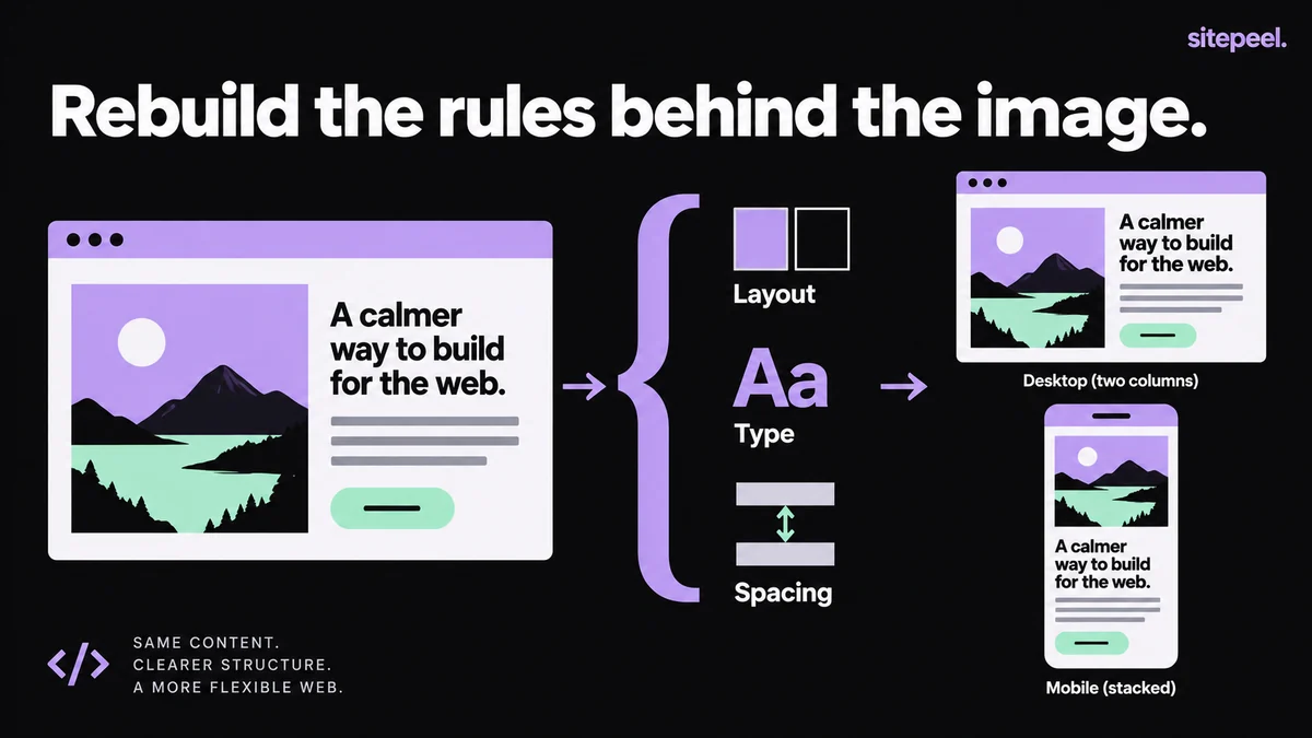
Use document flow, grid or flex layout for ordinary sections. Define the content width, padding and gaps so the structure survives different text lengths. Absolute positioning is useful for intentional overlays, but positioning every paragraph by screenshot coordinates makes the page fragile.
The downloadable HTML below is an original two-column reference layout, not code extracted from someone else’s screenshot. Open it in a browser, resize it and replace the copy. It demonstrates a content-driven stack at narrow widths and a working link to the details section.
The values are illustrative design choices. Replace them with reviewed values from your brief; do not describe them as measured properties of your source image.
<!doctype html>
<html lang="en">
<meta charset="utf-8">
<meta name="viewport" content="width=device-width, initial-scale=1">
<title>Responsive reference example</title>
<style>
  * { box-sizing: border-box; }
  body { margin: 0; font: 1rem/1.6 system-ui, sans-serif; color: #202020; background: #f5f3ee; }
  main { width: min(100% - 2rem, 68rem); margin: 3rem auto; }
  .hero { display: grid; grid-template-columns: repeat(2, minmax(0, 1fr)); gap: 2rem; align-items: center; }
  h1 { font-size: clamp(2rem, 5vw, 3.5rem); line-height: 1.1; margin: 0 0 1rem; overflow-wrap: anywhere; }
  p { max-width: 48ch; }
  .action { display: inline-block; padding: .75rem 1rem; border-radius: .5rem; background: #202020; color: white; }
  a:focus-visible { outline: 3px solid #66509a; outline-offset: 4px; }
  aside { padding: 1.5rem; background: #e5ddf0; border-radius: 1rem; }
  #details { margin-top: 3rem; }
  @media (max-width: 42rem) { .hero { grid-template-columns: 1fr; } }
</style>
<main>
  <section class="hero" aria-labelledby="title">
    <div>
      <h1 id="title">Make room for your next idea.</h1>
      <p>A small reference layout with real text, flexible columns and a clear next step.</p>
      <a class="action" href="#details">Explore the example</a>
    </div>
    <aside aria-label="Example design notes">
      <h2>What to compare</h2>
      <ul><li>Heading wrap</li><li>Column spacing</li><li>Narrow-screen order</li></ul>
    </aside>
  </section>
  <section id="details"><h2>Build on the structure</h2><p>Replace these example choices with your own reviewed content and design values.</p></section>
</main>
</html>
Give an AI assistant a bounded implementation brief
Specify the target framework, the section to build and the evidence it may use. Ask the assistant to preserve real content, use semantic controls and list missing information. Request one small implementation you can run and review.
Avoid a prompt that demands an exact clone without supplying behavior or assets. That encourages confident guesses. A useful first result can be visually close while still clearly listing the parts that require a decision.
Implement the hero section shown in the attached screenshot in [framework].

Evidence:
- Screenshot size and capture viewport: [known values or unknown].
- Verified design notes: [attach notes or DESIGN.md].
- Approved copy and assets: [provide them].

Use semantic HTML and a flexible layout. At narrow widths, keep the content readable and preserve its logical order. Do not invent customer logos, testimonials or interaction behavior.

First list unclear details. Then implement the section and explain the chosen layout rules. Separate measured values from assumptions. Include the exact steps to preview it and a checklist for visual and keyboard review.
Compare the result in the same conditions
Render the implementation at the reference width and wait for fonts and images. Compare the largest relationships first: container edges, column proportions, heading wrapping and section spacing. Fix one cause before compensating with several unrelated margins.
Then test a narrow width, a longer heading and keyboard navigation. Verify every link and button. A screenshot can show a beautiful form without proving that its labels, validation or submission work.
Keep a short difference log with “verified,” “intentional change” and “unresolved.” This prevents an approximation from silently becoming the source of truth for later pages.