

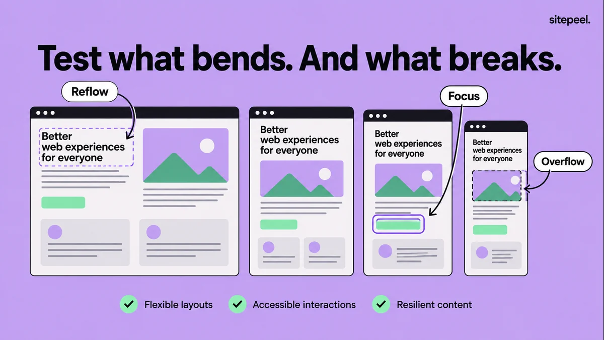
Choose a small but useful test matrix
Start with representative widths such as 320, 390, 768 and 1440 CSS pixels, then drag between them. These are example test points, not universal breakpoint requirements. Add widths where your own content begins to collide or wrap awkwardly.
Repeat important checks with a short viewport height. A dialog that fits on a tall desktop window may hide its close button or primary action when the available height is reduced. Test portrait and landscape where the product supports them.
Use Chrome device mode for quick iteration, then verify important journeys on real devices. Emulation approximates parts of the environment and cannot establish every detail of a physical phone’s browser, keyboard and touch behavior.
| Variation | What to exercise | Evidence to record |
|---|---|---|
| Narrow width | Header, navigation, cards and forms | Clipped content or horizontal scrolling |
| Between breakpoints | Gradually resize a content-heavy section | The width where the layout first fails |
| Long content and zoom | Long title, translated label, enlarged text | Wrapping, truncation and reachable actions |
| Short height and keyboard | Open a dialog or focus a form field | Controls covered or outside the visible area |
| Real phone | Tap, scroll and complete the main journey | Device, browser, orientation and failure steps |
Review the header and the first useful action
Check that the logo, product name and primary action fit together. Open the mobile navigation and move through it using the keyboard. Verify that focus remains visible and that the menu can be closed without losing your place.
Test a longer account label and the signed-out state if the header changes after login. A layout can fit anonymous visitors while breaking for a customer with a longer name. Use representative test data instead of the shortest available string.
Look below a sticky header after navigating to a section link. The target heading and focused control should remain visible. Record the obstruction rather than adding arbitrary spacing to every section.
Exercise content, cards and forms
Replace a short heading with realistic long copy in your test environment. Check images with different proportions and cards with unequal descriptions. Flexible layouts should preserve reading order and access to actions even when the content is not symmetrical.
Submit an incomplete test form to expose validation messages. Then test a valid submission in a safe test flow and review loading, success and retry states. Errors often add text and height that were absent in the initial design.
Review comparison tables separately. A deliberate horizontal table region may be appropriate, while accidental page-wide scrolling usually hides other content. On this site, comparison rows stack on narrow screens to keep labels close to their values.
Investigate overflow before hiding it
Inspect the element and its parent when a page scrolls sideways. Common causes include a fixed width, an unbreakable string, an image without a size constraint or a grid child that cannot shrink. Hiding all horizontal overflow can conceal the symptom while leaving content inaccessible.
The read-only snippet below lists visible elements whose bounding boxes extend outside the viewport. Run it in DevTools on a page you are testing. Off-canvas menus and intentional carousels can appear in the list, so inspect each result before treating it as a defect.
After a source fix, repeat the same width and state. A local inspection or Sitepeel preview helps identify a cause, but the permanent correction belongs in the project’s styles and components.
const viewport = document.documentElement.clientWidth;
const candidates = [...document.querySelectorAll("body *")].filter((element) => {
  const rect = element.getBoundingClientRect();
  const style = getComputedStyle(element);
  return rect.width > 0 && rect.height > 0 &&
    style.visibility !== "hidden" && style.display !== "none" &&
    (rect.left < -1 || rect.right > viewport + 1);
});
console.table(candidates.map((element) => ({
  element: element.tagName.toLowerCase(),
  id: element.id,
  class: element.getAttribute("class") || "",
  left: Math.round(element.getBoundingClientRect().left),
  right: Math.round(element.getBoundingClientRect().right)
})));
// Inspect candidates. Intentional off-canvas content is not automatically a bug.Keep motion, keyboard access and zoom in the review
Check the main journey without a pointer, enlarge the page and review reduced-motion behavior when the design uses animation. Keep controls recognizable and reachable. These checks often reveal problems that a screenshot comparison misses.
Use Chrome’s Rendering tools to explore supported emulation settings, but record what you actually exercised. “Mobile tested” is too vague to tell the next reviewer whether that included a form, a dialog or only the initial hero.
Finish with a short issue list ranked by blocked user tasks. Fix an unreachable purchase action before adjusting a minor decorative gap, then rerun the affected journeys.
# Responsive release checklist

Route and build:
Browser / device / viewport / zoom:

- [ ] Header and primary action fit.
- [ ] Navigation opens, closes and supports keyboard use.
- [ ] Long headings and labels remain readable.
- [ ] Images and cards fit without accidental page overflow.
- [ ] Tables remain understandable.
- [ ] Empty, loading, error and success states checked.
- [ ] Focus is visible and not covered by sticky UI.
- [ ] Short height, zoom and reduced motion reviewed.
- [ ] Main journey verified on a real phone.

## Each failure
Steps:
Expected / actual:
First failing width or state:
Screenshot or recording:
Source fix:
Retest result: