

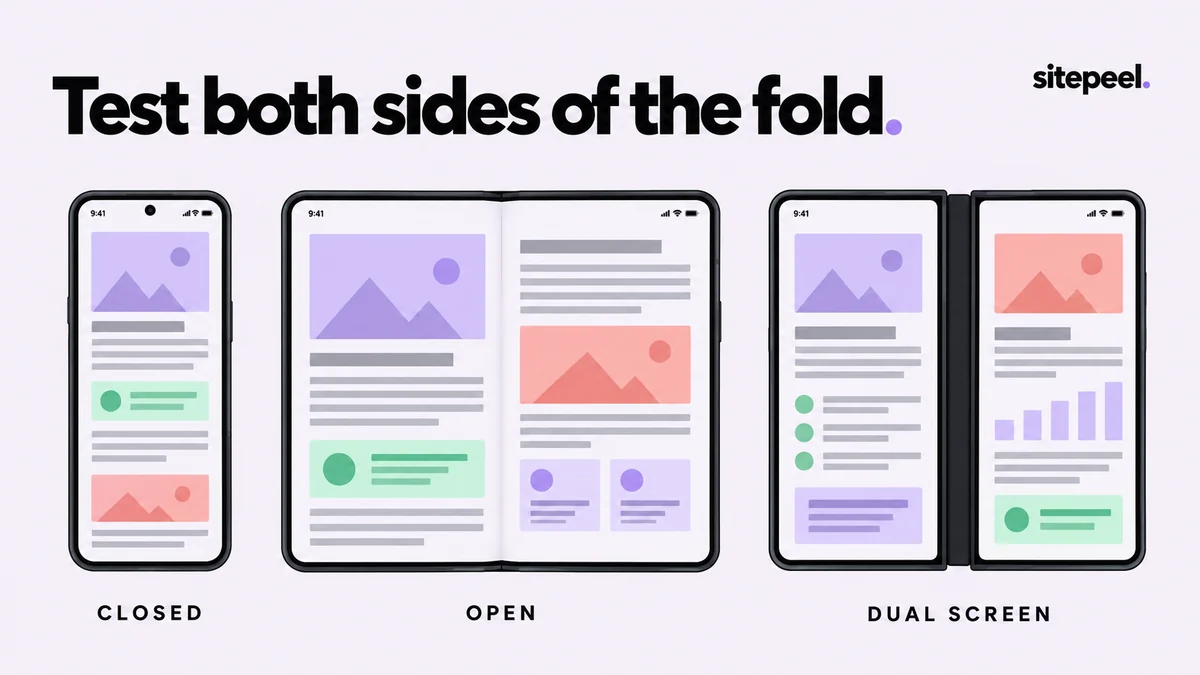
Separate a wider screen from a divided screen
An unfolded continuous display gives the page more space, but a dual-screen device can introduce a physical gap. A two-column layout that looks balanced on a tablet may place a button or sentence across that gap. Treat the available regions as part of the design problem.
Do not use the open screen’s width as the only acceptance criterion. Decide which information should stay together: a label and its field, a plan name and its price, or a navigation item and the content it selects. An attractive overall composition is not enough if an essential control lands in an unusable position.
Create a comparison in Responsive viewer
Choose a supported foldable preset from the device dropdown and compare the available closed or single-screen mode with the open or dual mode. Add a conventional narrow phone alongside it. Use Show device mockup when the outline or hinge helps explain the comparison. Read any approximate-preset labels instead of treating the artwork as a measurement.
Use a grid for a repeatable review, or the free canvas to arrange the relevant previews together. Drag each device by its header and use the scale slider to fit the workspace. Scaling the displayed device does not change the CSS width under test. Keep the same route and comparable content in every preview.
Check the places where a layout changes its meaning
A wider form can become harder to scan if its fields stretch across the whole display. A product grid may need another column, while an article may benefit more from a constrained reading width. Avoid applying the same “stretch everything” response to every component.
For a divided layout, review focus order and the relationship between panes. A selected item on one side should lead clearly to its details on the other. If you intentionally place content in separate regions, provide a useful single-screen arrangement too.
| State | Inspect | Useful outcome |
|---|---|---|
| Closed or single screen | Navigation, long labels, forms | The main task remains possible in one narrow region |
| Open continuous screen | Reading width and number of columns | Extra space improves organization rather than stretching everything |
| Dual screen | Buttons, text and pane boundaries | Essential content stays clear of a physical gap |
| Rotated or resized | Menus, dialogs and page state | The user can continue the task after the layout changes |
Test the transition, not only the endpoints
Choose a task such as selecting a plan, filling a form or opening a navigation panel. In an environment that supports the actual posture change, move between states halfway through the task. Watch whether input is preserved, focus stays useful and the next action remains reachable.
Independent preview frames are useful for comparing appearance, but they do not by themselves prove that one running page handles a real fold event. Record the transition as a separate test. If the page depends on posture or viewport-segment APIs, test those APIs in a supporting environment and check the fallback when they are unavailable.
Know what the desktop preview proves
Sitepeel’s presets help inspect layout widths, orientation and visual composition. A device illustration does not install that device’s operating system or browser engine. An iPhone frame in desktop Chrome is not Safari, and a drawn hinge does not prove that a page receives segmented-viewport information.
Chrome DevTools provides additional controls for supported dual-screen devices and postures. Use those where applicable, then check the target device when hardware-specific behavior matters. Name the browser and test environment in your report so another developer knows what was actually verified.
Foldable review
Route: /account
Task: choose a plan and reach checkout
Comparison: closed, open, dual-screen layout
Check: plan label, price and button stay together
Transition: preserve selection and keyboard focus
Desktop layout result: record separately
Target hardware / browser result: record separately
Using these tools in Sitepeel
The Sitepeel steps below describe the 1.0.3 tools. Preview 1.0.3 here. Browser-store availability may vary while the update rolls out. Try them on public Sitepeel pages in the website demo; use the installed extension for other websites. Changes made with inspection and preview tools do not publish changes to a website.