

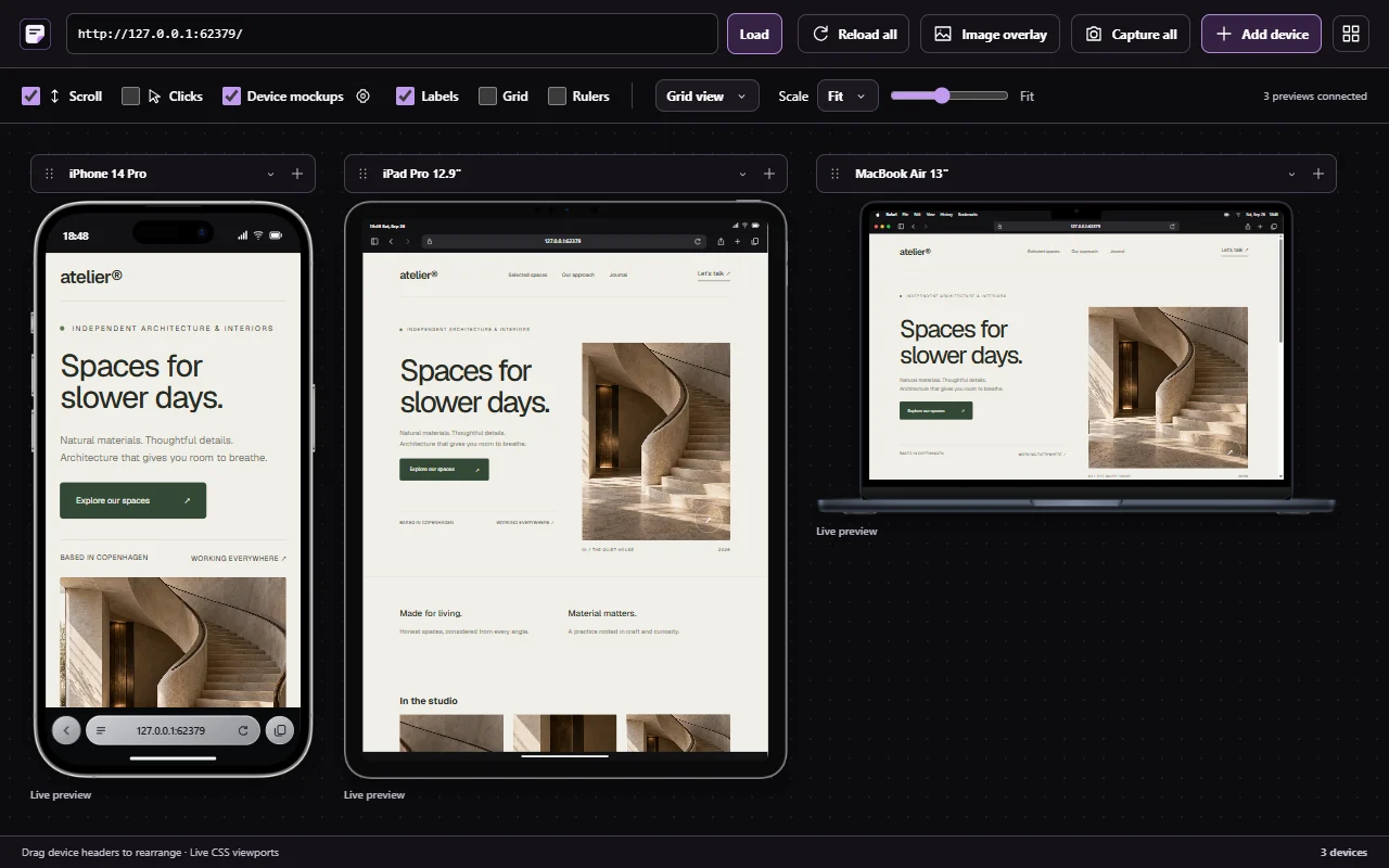
A workspace for comparing layouts
Use phone, tablet, laptop, desktop and foldable presets, or set a custom CSS width and height. Switch to a different device from its name dropdown. Expand a device’s controls when you need rotation, scale or capture, then collapse them to focus on the page.
Arrange previews in a grid, row, stack or free canvas. Drag device headers to place them freely, fit previews to the available space and use a scale slider for closer inspection.
Compare the same details across widths
Synchronized scrolling helps you compare corresponding sections. Optional click synchronization, grid and ruler overlays, labels and reference-image overlays support more focused reviews. Capture a device preview or the set when you need to share the result.
Device mockups add a visual frame and optional status and browser controls. Their appearance can help communicate a reference; the usable page dimensions remain the important measurement. Some model artwork and browser controls are approximations.
Foldable layouts and custom breakpoints
Supported foldable presets offer open/closed or single/dual modes to compare different layout space. Add custom dimensions near a breakpoint to check the widths between familiar devices.
These previews resize the page. They do not emulate device operating systems, physical hinges, touch hardware or viewport-segment APIs. Test those behaviors on appropriate hardware and developer tools.
Know what a browser preview can tell you
The viewer uses your current browser engine. An iPhone frame in Chrome does not run Safari. Use the preview to find layout issues, then verify browser-specific behavior, mobile keyboards, touch and performance on real devices.
Some websites block embedded previews. Open those pages in a regular tab and use browser developer tools. The website demo previews Sitepeel public pages; install the extension to use the viewer with other websites.