

Version and availability
This guide covers Sitepeel 1.0.3. Preview 1.0.3 here. Browser-store availability may vary while the update rolls out. The website demo lets you try the updated tools on public Sitepeel pages without an account.
Choose sizes that answer different questions
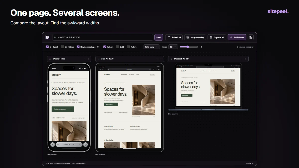
Open Responsive viewer from Sitepeel tools. Use the device-name dropdown to change a preset or Add device for another comparison. Start with three viewports: a narrow phone for wrapping, a tablet for the transition to columns and a desktop for maximum widths.
Do not assume a familiar phone model covers every mobile visitor. A page can fit at 390 CSS pixels but overflow at 360. Add custom dimensions around the point where the layout starts to fail. Preset dimensions describe CSS layout space, not the number of physical pixels on the device.
| Comparison | Look for |
|---|---|
| Narrow phone | Navigation, horizontal overflow, clipped actions and long words |
| Tablet or small laptop | Awkward partial columns, stretched cards and excessive whitespace |
| Wide desktop | Unreadable line lengths, large gaps and oversized images |
| Between two breakpoints | Content that only fits at the exact preset widths |
Keep scale separate from viewport size
Open a device’s controls to rotate it or change its scale. A 50% preview of a 390-pixel-wide viewport still tests a 390-pixel-wide layout. It simply takes less room on your desktop. Use a custom width or another preset when you want to test a different breakpoint.
Choose Free canvas when you want to arrange a phone beside a particular desktop section. Drag the device header, or use Grid view for an orderly comparison. Collapse the controls after adjusting a device so the page gets more space. Scroll synchronization helps line up content; turn it off when the layouts require different positions.
Test the content most likely to break
Review the header, hero, repeating cards, forms and footer in that order. Check long labels rather than only the short examples used during design. Test an empty state and an error message if your application has them. A polished hero does not tell you whether a three-line validation error fits beside an input.
In the installed extension, load the page you want to inspect. Some sites block embedded previews or depend on a browser context the preview cannot reproduce. If a preview cannot connect, open the page normally and use browser developer tools. The website demo is limited to Sitepeel’s public pages.
- Look for horizontal scrolling and buttons cut off at the edge.
- Check heading wraps, image crops and text inside fixed-height cards.
- Open navigation and check whether the intended next action is reachable.
- Verify focus, labels and error messages with the keyboard as a separate test.
Use foldable modes to compare layout space
For supported foldable presets, compare the closed or single-screen state with the open or dual-screen state. A wide screen should not automatically produce a stretched phone layout. Consider whether navigation, reading width or the number of columns should change.
A frame or hinge illustration does not emulate the operating system or its viewport-segment APIs. Test actual fold and posture behavior with tools that support those APIs and with the target hardware. A preset marked approximate should be treated as a useful layout reference, not an exact measurement of that model.
Record a bug someone can reproduce
Capture the affected device, write the usable viewport dimensions and describe the expected behavior. Include the route and the content that caused the problem. For example: “At 360 × 740, the long plan name pushes Continue beyond the right edge; the button should wrap below the name.”
After changing the CSS, reload the previews and test nearby widths. Then check the fix in the actual target browsers. A phone frame in a desktop Chrome window still uses the current browser engine; it does not become Safari on an iPhone. Device previews are a layout check, not a substitute for hardware, keyboard, touch, performance or accessibility testing.
Responsive review
Route: /pricing
Viewport: 360 × 740 CSS px
State: Long plan name selected
Problem: Continue action is clipped
Expected: All actions remain visible and usable
Verification: 360, 390 and 768 px; real mobile browser