

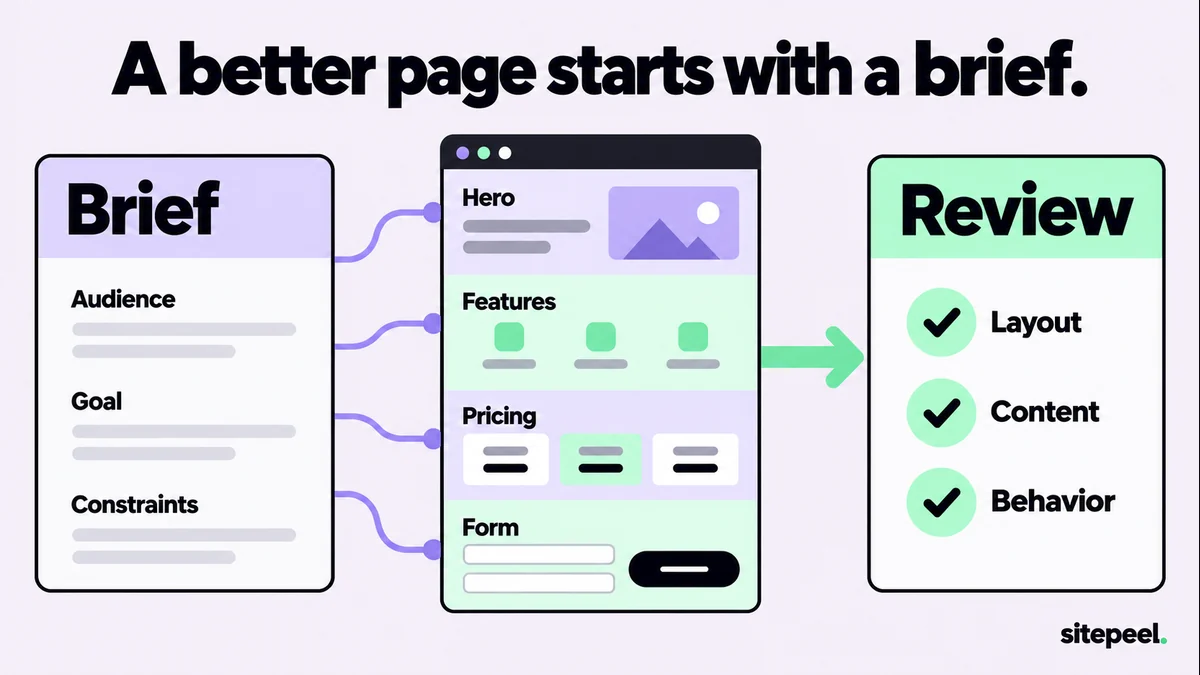
Prepare the inputs before choosing a prompt
Write down who the page serves, what they can actually do with the product and the one action you want them to take. Provide approved product facts, pricing and proof. Leave unavailable evidence out instead of asking the assistant to make the page “look trusted.”
Add a reviewed design reference when visual direction matters. Sitepeel can collect Design MD and a design prompt from a live page, but you still need to provide your own product story and requirements. A reference supplies observed details, not permission to copy another brand.
Replace every bracketed field before using a template. If a fact is unknown, say so explicitly. Ask for questions before code when the missing information would change the customer journey.
1. A complete landing-page brief
Use this when you have the product facts but have not decided the page hierarchy. Review the outline and copy before asking for an implementation. This keeps a weak offer from being buried inside polished styling.
Plan a landing page for [product] serving [specific audience].

Problem: [what they are trying to do].
Offer: [what the product actually provides].
Primary action: [one action and its real destination].
Approved facts, pricing and proof: [provide only verified material].
Design reference: [attach reviewed DESIGN.md, screenshots or notes].
Technical constraints: [framework, existing components, required integrations].

First propose the section order and concise copy. Explain how each section helps the visitor decide. Use one main heading. Do not invent testimonials, customer logos, usage figures or scarcity. Flag missing facts. Wait for the outline to be reviewed before implementing.
2. A hero that says what the product does
Use this to replace a vague headline with a concrete offer. Supply the actual product action and audience; adjectives such as “powerful” or “revolutionary” cannot substitute for that information. Test the headline with real copy at a narrow width.
Write three hero options for [product] for [audience].
The concrete outcome is [outcome]. The product works by [short factual explanation].
Primary CTA: [label and destination]. Available visual: [real screenshot or demo].

For each option provide one heading, one supporting sentence and the CTA label. Keep the promise within the supplied facts. Make the choices meaningfully different in emphasis. Do not add unsupported superlatives. Recommend one and explain its tradeoff. Then check how it reads without the product image.
3. A feature section tied to real use cases
Use this when a page has a wall of features without explaining why they matter. The example mapping should come from how the product works. Ask for a short list and combine duplicates before adding decorative cards.
Turn these verified capabilities into a concise feature section: [capabilities].
Audience tasks: [real tasks]. Available demonstrations: [screenshots, videos or examples].

For each selected capability write: the user task, what the tool does, a concrete example and one relevant limitation. Group overlapping items. Suggest a compact layout using our existing components. Do not create extra features or claim that a demonstration proves every use case. Link to [relevant guide or tool routes] where more detail is useful.
4. A pricing section without invented urgency
Provide exact prices, billing terms and what the checkout actually charges. A clear comparison is more useful than fabricated crossed-out prices, timers or customer counts. Include a campaign limit only when you have a real one to maintain.
Design a compact pricing section from these approved facts:
- Current prices and currencies: [values].
- Tax handling: [exact checkout behavior].
- Billing model: [one-time or recurring].
- Included access and updates: [facts].
- Actual discount or campaign terms, if any: [facts].
- CTA and checkout destination: [route].

Show the purchase decision clearly on desktop and mobile. Separate installation from paid activation if they are different steps. Do not invent a previous price, a deadline or remaining places. Flag any mismatch between the visible offer and checkout requirements.
5. A signup or contact form with complete states
Use this after deciding what information the service truly needs. A form is not finished when the initial screenshot looks good. Review labels, validation, pending submission, server failure and the success destination.
Implement a [signup/contact] form for [purpose] in [framework].
Required fields: [fields and why needed]. Optional fields: [fields].
Server endpoint and response contract: [real contract or explicitly missing].
Success behavior: [destination or message].

Use visible labels and appropriate input types. Define empty, invalid, submitting, server-error and success states. Preserve user input after a recoverable error. Make status messages accessible and prevent accidental duplicate submissions. Do not simulate a successful server action when no endpoint exists. Include keyboard and narrow-screen verification steps.
6. A review prompt before you publish
Use this on a working preview with the approved brief attached. Ask the assistant to cite the actual element or behavior behind each finding. A review that separates evidence from assumptions is easier to act on than an arbitrary score.
Run the resulting checks yourself or in a browser-based workflow. A text-only assistant cannot verify a checkout, a focus sequence or responsive rendering merely by reading the intended design. Record which checks were performed and which remain open.
Review this landing-page implementation against [approved brief].

Check: clear offer, factual claims, CTA destinations, pricing consistency, heading structure, image alternatives, readable narrow layouts, visible keyboard focus and complete form states.

For every finding provide the route, element or state; observed behavior; user impact; and smallest useful correction. Separate verified failures from questions. Do not invent test results. List the browser checks actually performed and the ones still needed. Prioritize blocked user journeys before visual polish.Turn feedback into one clear next iteration
Give the assistant an observed problem and the outcome you need: “At 390 pixels the primary CTA wraps outside the card; keep the label readable and the card within the viewport.” That is easier to verify than “make it more premium.”
Preserve the approved content and design decisions in a shared reference. After each change, repeat the affected checks. Do not ask for a complete redesign every time one button or heading needs attention.
The useful result is a page whose claims, layout and interactions survive review. Prompt length alone does not establish quality, and no template can guarantee rankings or conversions.