

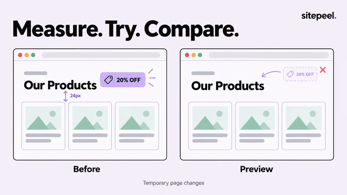
Capture the starting state
Choose the exact route and viewport where the problem appears. Close unrelated overlays and let the page settle. Take a baseline capture before moving anything so the original hierarchy remains available for comparison.
Write a single hypothesis. For example: the promotion badge competes with the main heading, or a floating widget covers the form action. A focused question makes it easier to judge whether the experiment helped.
Measure the element and its surroundings
Open Inspect & measure and select the element that defines the area. Look at the enclosing box as well as the visible text. The gap you see may come from a parent's padding, a child's margin, layout gap or line height.
Record the measurement with its context. A number without the element, viewport and state is difficult to reproduce. Check a second nearby component to see whether the value is a repeated pattern or a local exception.
| Observation | Include | Why |
|---|---|---|
| Spacing | Element pair, direction and viewport | Explains where the gap belongs |
| Size | Selected box and parent constraint | Avoids confusing text width with component width |
| Overlap | Both elements and the page state | Makes the problem reproducible |
| Hierarchy | What receives attention first | Connects the experiment to its purpose |
Move or remove one element temporarily
Choose Move & delete, select the intended element and try the small change needed for your hypothesis. Moving a badge or removing a distracting overlay can make an alternative easy to discuss. Confirm the selection before removing a larger wrapper.
Use undo to compare with the starting point. If page scripts rerender a component or a temporary change becomes confusing, reload the page and repeat from the baseline. Do not assume that dragging an element creates a durable responsive layout rule.
Distinguish appearance from implementation
A visual move can look good at one width while leaving the document order, keyboard sequence or parent layout unchanged. That is why the experiment should end with a source-level requirement rather than a demand to reproduce the exact dragged position.
For example, replace 'put this card here' with 'stack the promotion below the heading on narrow screens, preserve reading order, and keep the primary action visible.' Then implement that behavior in the actual project using its layout system.
Layout experiment
Route/state: /contact, form ready
Observation: floating promotion overlaps the submit button
Temporary test: remove the promotion and capture again
Proposed source fix: reserve space or hide the promotion at this width
Verify: keyboard focus, longer errors and nearby viewport widths
Attach: before.png and proposed-layout.png
Document the change for review
Capture the same area and scale before and after. Use an arrow or a short annotation to show the difference, then include the proposed behavior in the issue description. A screenshot should support the explanation rather than force someone to guess what changed.
Check the implemented change again with realistic text and the target browser. The temporary page edit answered a design question; the final test confirms that the source fix behaves correctly after reload and across states.
Try the workflow in Sitepeel
These steps describe the 1.0.3 tools. Preview them on public Sitepeel pages in the website demo; browser-store availability may vary while the update rolls out. Use the installed extension to work on other supported websites. Inspection and preview changes do not publish changes to the original site.