

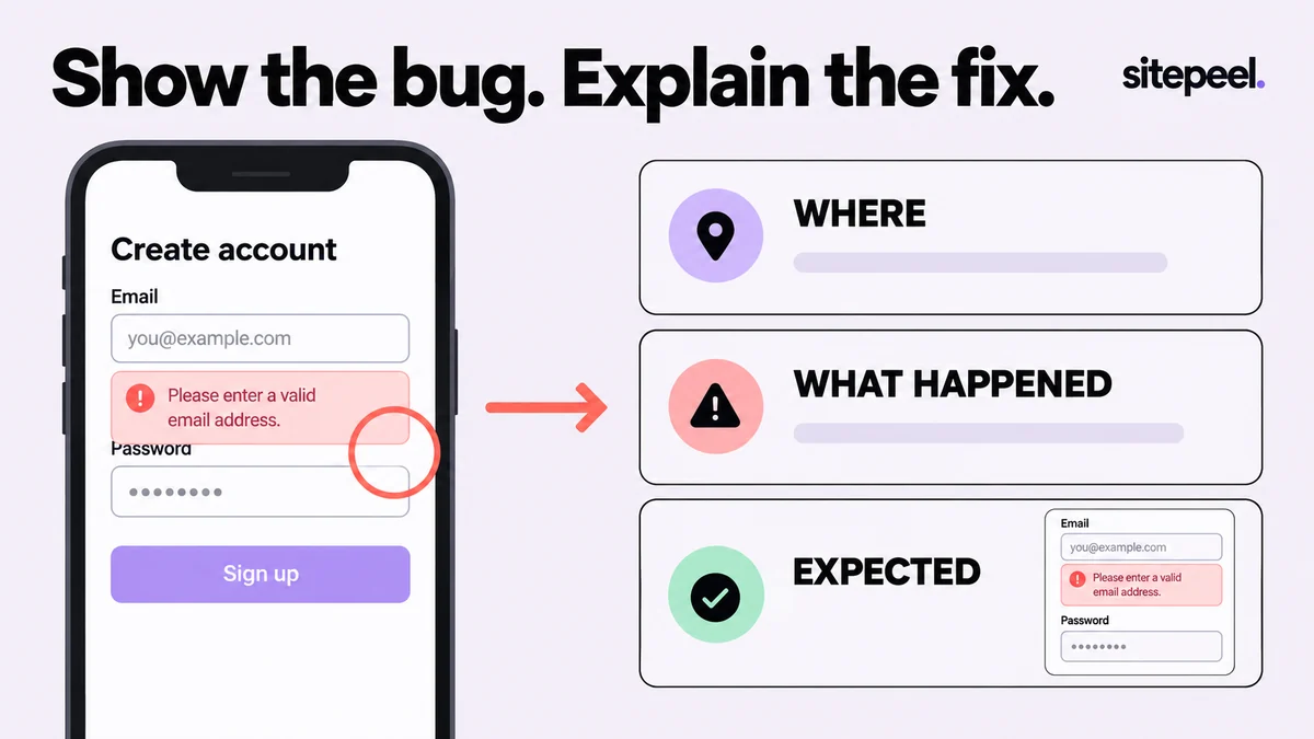
Describe the problem before reaching for the arrow tool
Write one sentence with a trigger and an observable result. “On /signup at 390 CSS pixels wide, submitting an empty email field makes the error overlap the password label” gives a developer a starting point. “The mobile form looks wrong” does not.
Keep separate defects separate. A font mismatch, a broken submit action and an overlapping error message may need different owners and different fixes. One report can link to the others, but its screenshot should have a clear main subject.
Capture the state that exposes the issue
Open the menu, trigger the error or choose the long option before taking the screenshot. Record the viewport in CSS pixels and the browser version. If the issue depends on zoom, language or a signed-in state, include that condition without sharing credentials.
Use Snip & capture for a precise region or Pick an element for a component with a useful boundary. Keep nearby labels and headings when they help identify the location. For a page-wide layout problem, include an overview plus a readable detail rather than one enormous image with tiny text.
Use one annotation to direct attention
In the capture editor, adjust the crop first, then open Edit. Add one arrow, rectangle or short text note. Put the note in nearby empty space so it does not cover the defect. If you need many marks, consider whether you are describing several issues at once.
Describe the expected relationship rather than an arbitrary visual preference. “The next field moves down when the message wraps” is more actionable than “add some space.” Use measurements when the spacing itself is the issue, and state whether they are observed values or proposed targets.
Copy this report template
The following example separates facts, expectations and verification. Replace each value with what you observed. Include reproducibility, such as “every time after a fresh load” or “only after switching plans,” instead of suggesting certainty when the problem is intermittent.
Title: Signup error overlaps the next field at 390px
URL / route: /signup
Browser and version: record the tested browser
Viewport: 390 × 844 CSS px
State: signed out, default language, browser zoom 100%

Steps
1. Open /signup.
2. Leave the email field empty.
3. Submit the form.

Actual: Error text overlaps the password label.
Expected: The error wraps and the next field moves down.
Frequency: Every time in this test.
Attachment: signup-empty-email-390px.png

After the fix
Repeat the steps at 390px and nearby widths.
Check keyboard focus and a longer error message.Close the report with the same test
After the source change, return to the original route, viewport and state. Repeat the same steps before comparing screenshots. A different viewport or shorter error message can hide the defect and make an unfixed issue look resolved.
Keep a before-and-after pair when it helps the reviewer understand the change. Then test one nearby width and one harder content case. For the form example, use a longer error and tab through the controls. Record what passed and any limits of the test instead of saying that the whole website is now bug-free.
Using these tools in Sitepeel
The Sitepeel steps below describe the 1.0.3 tools. Preview 1.0.3 here. Browser-store availability may vary while the update rolls out. Try them on public Sitepeel pages in the website demo; use the installed extension for other websites. Changes made with inspection and preview tools do not publish changes to a website.