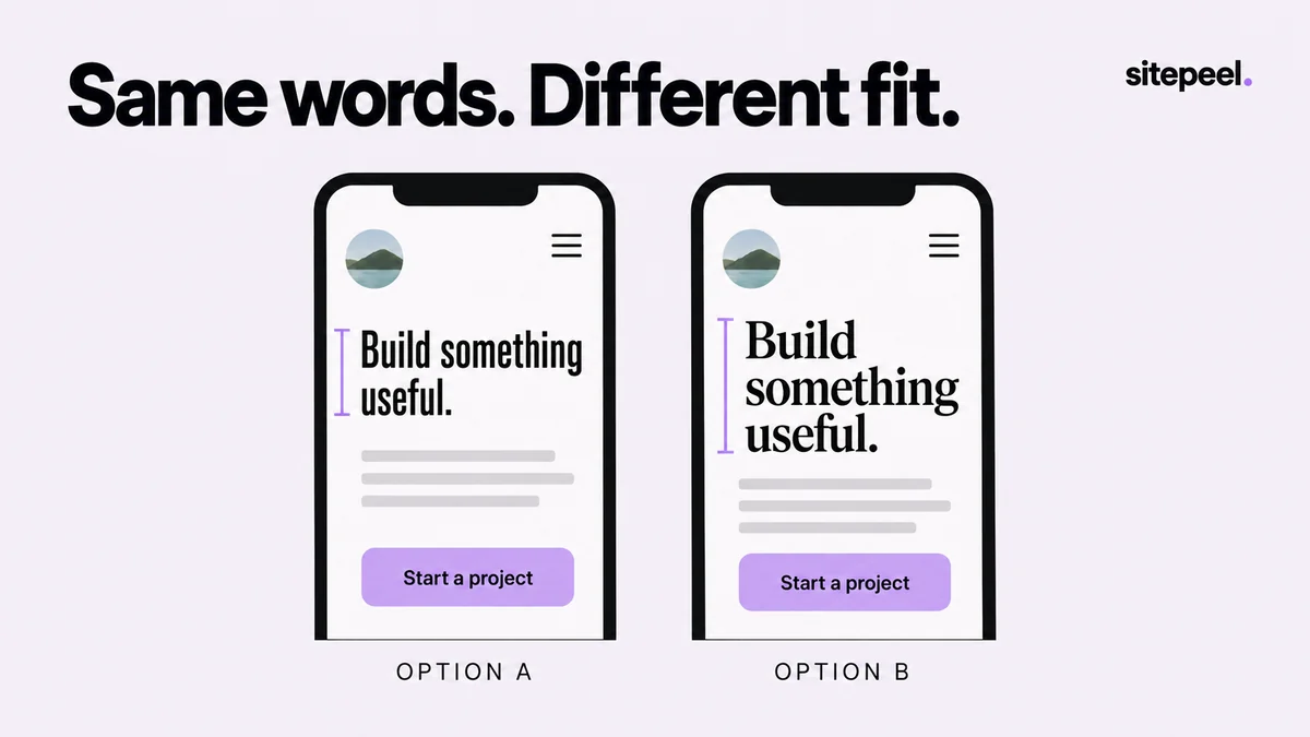
Choose a page with difficult text
Use a page that contains a long heading, a paragraph, navigation, a form and a compact button. If you only test a short hero title, almost every candidate can look convincing. A realistic comparison includes the tight spaces where a different typeface is most likely to expose a problem.
Capture the starting page and record the current family, size, weight and line height with Detect fonts. Keep the viewport and content fixed while comparing candidates. Changing the wording, width and font at the same time makes it hard to understand what improved.
Record the existing typography →
Preview headings and body text separately
Open Swap fonts in Sitepeel and choose whether the preview affects headings, body text or both. Search the font catalog or use an available font option appropriate to your project. Begin with one change: a heading face with the original body font, or a body face with the original headings.
Review two or three candidates instead of browsing indefinitely. Read the actual copy aloud or scan it as a visitor would. A distinctive heading can work with quiet body text, but the combination still needs to fit the content and provide clear emphasis. The tool is a temporary preview; closing its panel restores the page’s fonts.
Compare layout behavior, not only personality
Look at the longest heading and the smallest control first. A wider face can turn a two-line title into four lines or make a navigation row collide with an account button. A taller x-height may improve the appearance of a small label while also changing the density of a table.
Check the exact weights the project needs. A browser can render a fallback or synthesized style when a requested face or weight is unavailable. Confirm the intended font has loaded before choosing a candidate from a screenshot.
A useful type comparison| Page element | Question to answer |
|---|
| Hero heading | Does the same text wrap into a useful shape? |
|---|
| Body paragraph | Can you read several sentences comfortably? |
|---|
| Navigation and buttons | Do long labels still fit without clipping? |
|---|
| Form labels and errors | Is the hierarchy clear when an error wraps? |
|---|
| Prices or tables | Are repeated numbers easy to compare? |
|---|
| Long or translated content | Does the layout handle the project’s real character set? |
|---|
Repeat at a narrow viewport
Review the chosen pair at desktop and mobile widths. Keep the same text in both. If you are comparing independent responsive previews, do not assume a temporary font edit in the original tab automatically propagates to every frame. Reproduce the intended typography in the page or test fixture being reviewed.
A font that looks balanced in a wide hero may leave a single word on the last line on mobile. Fix the composition with appropriate type sizing, line height and content width in the source. Avoid forcing a line break just to make one screenshot look better if that break fails at nearby widths.
Check the candidate across viewport widths →
Troubleshoot a font that renders differently →
Turn the preview into a small implementation brief
Record the selected families, required weights, where each is used and a licensed source for the actual files. A visual preview does not add a production font dependency, configure loading or grant rights to use a font. Make those decisions in your project before publishing.
Add the decision to your Design MD reference along with screenshots and the layout checks that passed. The next developer should be able to reproduce the typography without guessing which family was applied to which role.
Typography decision
Heading family: chosen family and source
Body family: chosen family and source
Weights used: list only those required
Long heading: record desktop and mobile line counts
Controls: long navigation and button labels checked
Loading: intended face verified before capture
Implementation: source CSS and font files still required