
 Claude Code
 Cursor
 Codex
 GitHub Copilot
 Work & CoBrand
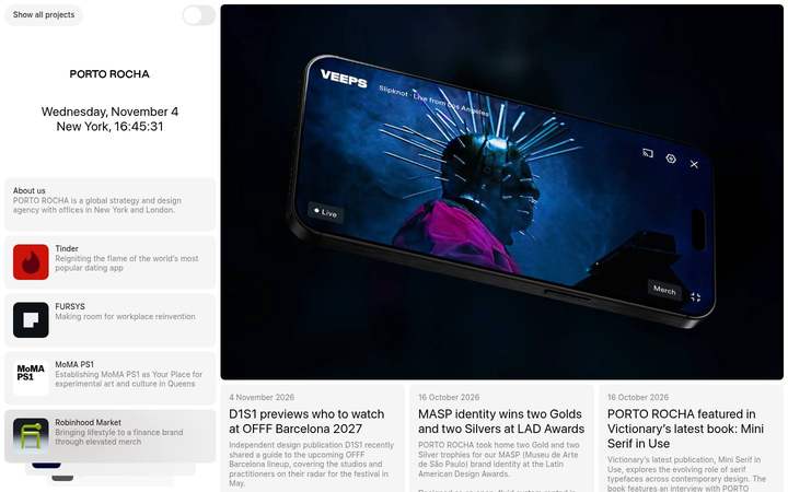
Agencies and studios · DESIGN.md · measured November 4, 2026
Porto Rocha design system
Porto Rocha’s website (portorocha.com) uses the sf-pro-display font on a white background. Measured by Sitepeel on November 4, 2026.
- #FFFFFF
- #F5F5F5
- #000000
From portorocha.com ↗ · 407 elements at 1440×900 and 390×844 Independent analysis, not affiliated with Porto Rocha
Porto Rocha color palette
6 colors with hex codes, grouped by where each one is used on the page.
Surfaces
White
#FFFFFFbackground · --color-blackPage background · 1×Snow
#F5F5F5surface-container-lowRaised areas one step from the page · 7×Near Black 4%
#0000000Aoverlay · --color-gray10Translucent fill for cards and controls · 99×Text
Near Black
#000000on-surface · --color-whitePrimary text and headings · 101×White
#FFFFFFon-primaryText and icons on primaryAccents
Near Black
#000000primary · --color-whitePrimary actions (the main text color; the palette is monochrome) · 121×Porto Rocha fonts and type scale
2 families.
Aasf-pro-displayWeights 400sf-pro-display, sans-serif
Aasf-pro-textWeights 400sf-pro-text, sans-serif
headline-displayPage title (h1)Porto Rocha23px · 400 · 1.17 · 0.02em
mobile 13.5px
mobile 13.5px
body-mdBody textThe quick brown fox jumps over the lazy dog14px · 400 · 1.25
Contrast
Text on #FFFFFF
AaAAA
21.0:1Spacing
8px grid · 98% of values fit
sm8pxmd16pxlg20pxgutter12pxBreakpoints: 656px 657px 768px 896px 897px 912px 913px 1024px 1025px 1280px
Shapes
Corner radii, most used first.
sm8px · 380×
md10px · 52×
Depth
Flat: no shadows measured.
Porto Rocha UI components
Rebuilt from the measured CSS.
Show all projects
Card
Motion
Interface transitions
0.5sease
Do’s and don’ts
Rules written from the measurements, so a coding agent stays on style.
- Use #FFFFFF for the page and lift surfaces in small steps: #F5F5F5.
- Let contrast carry emphasis; primary actions use #000000 on #FFFFFF.
- Keep spacing on the 8px grid.
- Use 8px corners on most elements; larger surfaces also use 10px.
- Add drop shadows for depth; use tonal surfaces.
- Introduce new font families beyond sf-pro-display and sf-pro-text.
- Add saturated accent colors; the measured palette is almost entirely neutral.
- Make interface transitions slower than 0.5s.
Porto Rocha DESIGN.md128 lines
---
version: alpha
name: Porto Rocha
description: "Light monochrome interface measured from portorocha.com: sf-pro-display type with sf-pro-text, tonal surfaces and 8px corners."
colors:
  background: "#FFFFFF"
  surface: "#FFFFFF"
  on-surface: "#000000"
  on-background: "#000000"
  surface-container-low: "#F5F5F5"
  overlay: "#0000000A"
  primary: "#000000"
  on-primary: "#FFFFFF"
typography:
  headline-display:
    fontFamily: sf-pro-display
    fontSize: 23px
    fontWeight: 400
    lineHeight: 1.17
    letterSpacing: 0.02em
  body-md:
    fontFamily: sf-pro-text
    fontSize: 14px
    fontWeight: 400
    lineHeight: 1.25
  headline-display-mobile:
    fontFamily: sf-pro-text
    fontSize: 13.5px
    fontWeight: 400
    lineHeight: 1.25
    letterSpacing: -0.023em
rounded:
  sm: 8px
  md: 10px
spacing:
  base: 8px
  sm: 8px
  md: 16px
  lg: 20px
  gutter: 12px
components:
  button-ghost:
    backgroundColor: "{colors.surface-container-low}"
    textColor: "{colors.on-surface}"
    typography: "{typography.body-md}"
    rounded: 40px
    padding: 0px 16px
  card:
    backgroundColor: "{colors.surface-container-low}"
    textColor: "{colors.on-surface}"
    typography: "{typography.body-md}"
    rounded: "{rounded.md}"
    padding: 16px
---

# Porto Rocha Design System

## Overview

Porto Rocha describes itself as: “PORTO ROCHA is a global strategy and design agency with offices in New York and London. We help brands navigate complex challenges through work that is strategically rigorous, emotionally resonant, and beautifully design” The interface is light, built on **White (#FFFFFF)** with **Near Black (#000000)** text and almost no color: actions are carried by contrast, not hue.

Type is set in **sf-pro-display** and **sf-pro-text**. Headlines run large; body text is 14px. The surface language is flat. Corners are mostly 8px.

Measured from [portorocha.com](https://www.portorocha.com/) on November 4, 2026 at 1440×900 and 390×844 from 407 rendered elements. Values are computed styles from the live page, not the original source files.

## Colors

The palette has 6 roles.

- **White (#FFFFFF):** Page background, seen 1 time. Token `background`, CSS `--color-black`.
- **Near Black (#000000):** Primary text and headings, seen 101 times. Token `on-surface`, CSS `--color-white`.
- **Snow (#F5F5F5):** Raised areas one step from the page, seen 7 times. Token `surface-container-low`.
- **Near Black 4% (#0000000A):** Translucent fill for cards and controls, seen 99 times. Token `overlay`, CSS `--color-gray10`.
- **Near Black (#000000):** Primary actions (the main text color; the palette is monochrome), seen 121 times. Token `primary`, CSS `--color-white`.
- **White (#FFFFFF):** Text and icons on primary. Token `on-primary`.

## Typography

**sf-pro-display** and **sf-pro-text** share the interface. Fallback stack: `sf-pro-display, sans-serif`.

- **headline-display:** sf-pro-display 23px at weight 400, line height 1.17, tracking 0.02em (13.5px on mobile). Page title (h1).
- **body-md:** sf-pro-text 14px at weight 400, line height 1.25. Body text.

## Layout

Spacing follows a 8px grid: 98% of measured gaps and paddings are multiples of 8px.

- **Scale:** sm 8px, md 16px, lg 20px.
- **Gaps:** 12px is the most common gap in flex and grid layouts.
- **Breakpoints:** 656px, 657px, 768px, 896px, 897px, 912px, 913px, 1024px, 1025px, 1280px.

## Elevation & Depth

The design is flat: no shadows were measured. Hierarchy comes from tonal surface steps (#F5F5F5).

## Shapes

Most elements use 8px corners. Measured radii, most used first:

- **sm (8px):** 380 elements.
- **md (10px):** 52 elements.

## Components

Measured from the rendered page. Token values reference the tokens above.

- **button-ghost (“Show all projects”):** #0000000A fill, #000000 text, 14px/400, 40px radius, padding 0px 16px.
- **card:** #F5F5F5 fill, #000000 text, 14px/400, 10px radius, padding 16px.

## Do's and Don'ts

- Do use #FFFFFF for the page and lift surfaces in small steps: #F5F5F5.
- Do let contrast carry emphasis; primary actions use #000000 on #FFFFFF.
- Do keep spacing on the 8px grid.
- Do use 8px corners on most elements; larger surfaces also use 10px.
- Don't add drop shadows for depth; use tonal surfaces.
- Don't introduce new font families beyond sf-pro-display and sf-pro-text.
- Don't add saturated accent colors; the measured palette is almost entirely neutral.
- Don't make interface transitions slower than 0.5s.

## Motion

Interface transitions are quick: 0.5s.

- **Easing:** `ease`.

Generated by [Sitepeel](https://sitepeel.dev/design-md/portorocha.com/), the free DESIGN.md generator (engine 2026.10.29+b828a475ee10).
Fonts
What font does Porto Rocha use?
Porto Rocha uses sf-pro-display (weight 400) and sf-pro-text (weight 400) on portorocha.com. Page titles are 23px at weight 400 (13.5px on phones) and body text is 14px. Measured on November 4, 2026.
- Aasf-pro-display · 400
- Aasf-pro-text · 400
Colors
Porto Rocha colors: palette and hex codes
Porto Rocha’s main colors are #FFFFFF (white) for the background and #000000 (near black) for text. Measured on November 4, 2026.
- #FFFFFF · white
- #000000 · near black
- #F5F5F5 · snow
Tech stack
What is Porto Rocha built with?
Porto Rocha’s website (portorocha.com) is built with Nuxt, Vue.js, Vercel and GSAP. Measured on November 4, 2026.
- JavaScript framework
- Nuxt 3.17.7, Vue.js 3.5.20
- Animation & 3D
- GSAP 3.13.0
- Hosting & CDN
- Vercel
- Analytics
- Google Analytics
What you can build with it
Landing pages, pricing tables, dashboards: your AI coding agent builds them in this style, with these colors, fonts, spacing and buttons instead of its defaults.
Download DESIGN.md, put it in your project’s root folder, then ask your agent for a page.
Build a landing page for my product. Follow for every color, font, spacing value, corner and button.
Need a page behind a login?
The DESIGN.md generator Chrome extension makes one from any page you have open, including dashboards and pages behind a login.
More in Agencies and studios
All DESIGN.md examples →
Work & CoBrand
 14islandsBrand
 Darkroom EngineeringBrand
 Josh W. ComeauBrand
 PentagramBrand
 HootsuiteBrand
Not in the library? Make a DESIGN.md from any site.
FAQ
Porto Rocha design system questions
What font does Porto Rocha use?
Porto Rocha’s website uses sf-pro-display (weight 400) and sf-pro-text (weight 400). Page titles are 23px at weight 400 (13.5px on phones) and body text is 14px. Measured on November 4, 2026.
What are the Porto Rocha colors and hex codes?
On portorocha.com: #FFFFFF (white) for the background and #000000 (near black) for text. The color palette above lists all 6 colors with their hex codes and where each one is used.
What is the Porto Rocha design system?
The design system on this page is portorocha.com’s, as measured on November 4, 2026: sf-pro-display type, 8px corners and a 8px spacing grid, written down as a DESIGN.md. It is not Porto Rocha’s own documentation.
What is Porto Rocha built with?
Porto Rocha’s website (portorocha.com) is built with Nuxt, Vue.js, Vercel and GSAP. The full tech stack Sitepeel found: Nuxt, Vue.js, GSAP, Vercel and Google Analytics. Measured on November 4, 2026.
What is the Porto Rocha DESIGN.md?
A plain-text file with Porto Rocha’s measured colors, type, spacing, corners and components as tokens, plus short rules, in the DESIGN.md format Google published with Stitch. Your AI coding agent reads it and builds in this style. More about DESIGN.md.
How do I use it with Claude Code or Cursor?
Download the file and put it in your project’s root folder, then ask your agent to follow DESIGN.md. Step-by-step guides: Claude Code, Cursor, Codex, GitHub Copilot.
Is this Porto Rocha’s official design system?
No. Sitepeel measured it from portorocha.com’s public page on November 4, 2026. It is an independent analysis, not made or approved by Porto Rocha.
Can I use Porto Rocha’s style in my own product?
Use it to learn, prototype and compare. For a real product, make the style your own, and never copy Porto Rocha’s logo, name, pictures or text.
How accurate are the values?
Each value was measured on the rendered page after it fully loaded, on desktop and mobile: colors where they appear, type with tracking, spacing, corners, shadows and hover states. Sites change, so check the date at the top.