
 Claude Code
 Cursor
 Codex
 GitHub Copilot
 iPhone Unlocking Store
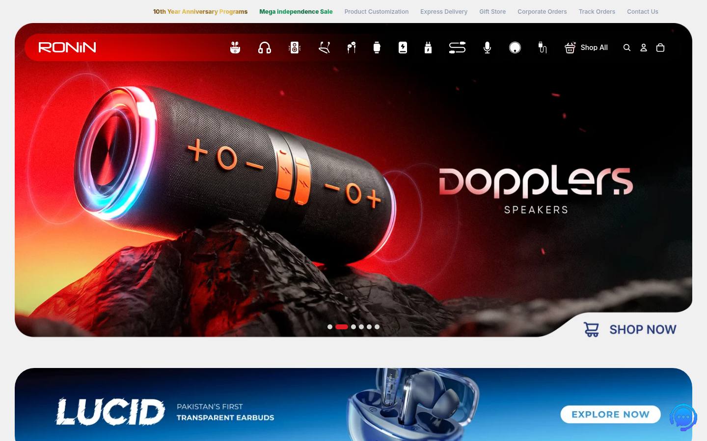
DESIGN.md · measured November 5, 2026
Ronin design system
Ronin’s website (ronin.pk) uses the Inter font on a #F0F0F0 background. Measured by Sitepeel on November 5, 2026.
- #F0F0F0
- #F3F2F2
- #464646
From ronin.pk ↗ · 429 elements at 1440×900 and 390×844 Independent analysis, not affiliated with Ronin
Ronin color palette
15 colors with hex codes, grouped by where each one is used on the page.
Surfaces
Mist
#F0F0F0background · --color-primary-button-hover-borderPage background · 1×Mist
#F3F2F2surface-container-lowRaised areas one step from the page · 4×White
#FFFFFFsurface-container · --color-whiteCards and panels · 8×Silver
#D9D9D9surface-container-highHover and pressed fills · 11×Silver
#D6D6D6surface-container-highestHighest raised elements · 7×White 60%
#FFFFFF99overlayTranslucent fill for cards and controls · 4×Charcoal 15%
#0D0D0D26overlay-strongStronger translucent fill · 1×Near Black
#000000inverse-surface · --color-variant-hover-textHigh-contrast fills · 4×Text
Graphite
#464646on-surface · --color-primary-hoverPrimary text and headings · 57×Blue
#8896ABon-surface-variantSecondary text · 12×White
#FFFFFFon-primaryText and icons on primaryAccents
Graphite
#464646primary · --color-primary-hoverPrimary actions (the main text color; the palette is monochrome) · 57×Borders
Near Black 6%
#0000000FoutlineBorders and dividers · 7×Silver
#CFCFCFoutline-variantSecondary dividers · 6×Status
Red
#E01D25errorErrors and destructive states · 2×Gradients
Ronin fonts and type scale
One family carries the whole interface.
AaInterWeights 300, 400, 500, 700Inter, sans-serif
headline-displayPage title (h1)Ronin25px · 700 · 1.2 · 0.03em
mobile 21px
mobile 21px
headline-lgSection headings (h2)The quick brown fox jumps over the lazy dog19px · 700 · 1.4
mobile 16px
mobile 16px
body-mdBody textThe quick brown fox jumps over the lazy dog14px · 400 · 1.6
body-lgLead paragraphsThe quick brown fox jumps over the lazy dog18px · 500 · 1.4 · 0.03em
body-smSecondary and small textThe quick brown fox jumps over the lazy dog12px · 400 · 1.2
captionCaptions and fine printThe quick brown fox jumps over the lazy dog11px · 300 · 1.4
label-lgLarge buttons and tabsThe quick brown fox jumps over the lazy dog15.5px · 700 · 1.4
label-mdButtons, navigation and labelsThe quick brown fox jumps over the lazy dog14px · 700 · 1.4
label-smSmall labels and badgesThe quick brown fox jumps over the lazy dog12px · 500 · 1.6
Contrast
Text on #F0F0F0
AaAAA
8.2:1AaLarge only
2.6:1Spacing
No strict grid · 29% are multiples of 4px
xs3.6pxsm8pxmd12pxlg18pxgutter10pxBreakpoints: 749px 750px 768px 990px 1024px 1025px 1200px 1201px 1400px 1550px 1551px
Shapes
Corner radii, most used first.
sm11px · 48×
full9999px · 44×
xs9.6px · 28×
md15px · 22×
lg25px · 16×
xl50px · 12×
Depth
Shadow
Inset
Ronin UI components
Rebuilt from the measured CSS.
Previous
View All
Email address
Card
Inline link
Motion
Interface transitions
0.125s0.25s0.3sease-in-outease-out
Do’s and don’ts
Rules written from the measurements, so a coding agent stays on style.
- Use #F0F0F0 for the page and lift surfaces in small steps: #F3F2F2, #FFFFFF, #D9D9D9, #D6D6D6.
- Keep text in 2 levels: #464646, #8896AB.
- Let contrast carry emphasis; primary actions use #464646 on #F0F0F0.
- Reuse the measured spacing steps (8px, 12px, 18px).
- Make buttons and chips fully rounded (9999px); most other elements use 11px corners.
- Use #8896AB for body text; it reaches 2.63:1 on #F0F0F0. Keep it for large text or metadata.
- Introduce new font families beyond Inter.
- Add saturated accent colors; the measured palette is almost entirely neutral.
- Make interface transitions slower than 0.3s.
Ronin DESIGN.md224 lines
---
version: alpha
name: Ronin
description: "Light monochrome interface measured from ronin.pk: Inter type, tonal surfaces and pill-shaped controls."
colors:
  background: "#F0F0F0"
  surface: "#F0F0F0"
  on-surface: "#464646"
  on-background: "#464646"
  on-surface-variant: "#8896AB"
  surface-container-low: "#F3F2F2"
  surface-container: "#FFFFFF"
  surface-container-high: "#D9D9D9"
  surface-container-highest: "#D6D6D6"
  overlay: "#FFFFFF99"
  overlay-strong: "#0D0D0D26"
  outline: "#0000000F"
  outline-variant: "#CFCFCF"
  primary: "#464646"
  on-primary: "#FFFFFF"
  inverse-surface: "#000000"
  error: "#E01D25"
typography:
  headline-display:
    fontFamily: Inter
    fontSize: 25px
    fontWeight: 700
    lineHeight: 1.2
    letterSpacing: 0.03em
  headline-lg:
    fontFamily: Inter
    fontSize: 19px
    fontWeight: 700
    lineHeight: 1.4
  body-md:
    fontFamily: Inter
    fontSize: 14px
    fontWeight: 400
    lineHeight: 1.6
  body-lg:
    fontFamily: Inter
    fontSize: 18px
    fontWeight: 500
    lineHeight: 1.4
    letterSpacing: 0.03em
  body-sm:
    fontFamily: Inter
    fontSize: 12px
    fontWeight: 400
    lineHeight: 1.2
  caption:
    fontFamily: Inter
    fontSize: 11px
    fontWeight: 300
    lineHeight: 1.4
  label-lg:
    fontFamily: Inter
    fontSize: 15.5px
    fontWeight: 700
    lineHeight: 1.4
  label-md:
    fontFamily: Inter
    fontSize: 14px
    fontWeight: 700
    lineHeight: 1.4
  label-sm:
    fontFamily: Inter
    fontSize: 12px
    fontWeight: 500
    lineHeight: 1.6
  headline-lg-mobile:
    fontFamily: Inter
    fontSize: 16px
    fontWeight: 700
    lineHeight: 1.4
  headline-display-mobile:
    fontFamily: Inter
    fontSize: 21px
    fontWeight: 700
    lineHeight: 1.2
    letterSpacing: 0.03em
rounded:
  xs: 9.6px
  sm: 11px
  md: 15px
  lg: 25px
  xl: 50px
  full: 9999px
spacing:
  xs: 3.6px
  sm: 8px
  md: 12px
  lg: 18px
  gutter: 10px
components:
  button-outline:
    backgroundColor: "{colors.overlay}"
    textColor: "{colors.inverse-surface}"
    padding: 1px 6px
    height: 50px
  button-ghost:
    backgroundColor: "{colors.surface-container-low}"
    textColor: "{colors.on-surface}"
    typography: "{typography.body-md}"
    rounded: "{rounded.lg}"
    padding: 12px 28px
    height: 38px
  input-field:
    textColor: "{colors.on-primary}"
    typography: "{typography.body-md}"
    rounded: 0px
    padding: 16px 28px
  card:
    backgroundColor: "{colors.background}"
    textColor: "{colors.on-surface}"
    typography: "{typography.body-md}"
    rounded: 0px
    padding: 0px
  link:
    textColor: "#FFFFFFF2"
---

# Ronin Design System

## Overview

Ronin describes itself as: “Discover RONiN smart wearables and tech accessories, from earbuds to smartwatches, built for performance, style, and everyday use.” The interface is light, built on **Mist (#F0F0F0)** with **Graphite (#464646)** text and almost no color: actions are carried by contrast, not hue.

Type is set in **Inter**. Headlines run large; body text is 14px. Depth comes from soft drop shadows. Controls are pill-shaped.

Measured from [ronin.pk](https://ronin.pk/) on November 5, 2026 at 1440×900 and 390×844 from 429 rendered elements. Values are computed styles from the live page, not the original source files.

## Colors

The palette has 15 roles, plus gradient stops #03B1E6, #0354CD, #5A5A72, #3015A4.

- **Mist (#F0F0F0):** Page background, seen 1 time. Token `background`, CSS `--color-primary-button-hover-border`.
- **Graphite (#464646):** Primary text and headings, seen 57 times. Token `on-surface`, CSS `--color-primary-hover`.
- **Blue (#8896AB):** Secondary text, seen 12 times. Token `on-surface-variant`.
- **Mist (#F3F2F2):** Raised areas one step from the page, seen 4 times. Token `surface-container-low`.
- **White (#FFFFFF):** Cards and panels, seen 8 times. Token `surface-container`, CSS `--color-white`.
- **Silver (#D9D9D9):** Hover and pressed fills, seen 11 times. Token `surface-container-high`.
- **Silver (#D6D6D6):** Highest raised elements, seen 7 times. Token `surface-container-highest`.
- **White 60% (#FFFFFF99):** Translucent fill for cards and controls, seen 4 times. Token `overlay`.
- **Charcoal 15% (#0D0D0D26):** Stronger translucent fill, seen 1 time. Token `overlay-strong`.
- **Near Black 6% (#0000000F):** Borders and dividers, seen 7 times. Token `outline`.
- **Silver (#CFCFCF):** Secondary dividers, seen 6 times. Token `outline-variant`.
- **Graphite (#464646):** Primary actions (the main text color; the palette is monochrome), seen 57 times. Token `primary`, CSS `--color-primary-hover`.
- **White (#FFFFFF):** Text and icons on primary. Token `on-primary`.
- **Near Black (#000000):** High-contrast fills, seen 4 times. Token `inverse-surface`, CSS `--color-variant-hover-text`.
- **Red (#E01D25):** Errors and destructive states, seen 2 times. Token `error`.

## Typography

**Inter** carries the whole interface. Fallback stack: `Inter, sans-serif`. Other loaded fonts: Gloriant.

- **headline-display:** Inter 25px at weight 700, line height 1.2, tracking 0.03em, uppercase (21px on mobile). Page title (h1).
- **headline-lg:** Inter 19px at weight 700, line height 1.4 (16px on mobile). Section headings (h2).
- **body-md:** Inter 14px at weight 400, line height 1.6. Body text.
- **body-lg:** Inter 18px at weight 500, line height 1.4, tracking 0.03em. Lead paragraphs.
- **body-sm:** Inter 12px at weight 400, line height 1.2. Secondary and small text.
- **caption:** Inter 11px at weight 300, line height 1.4. Captions and fine print.
- **label-lg:** Inter 15.5px at weight 700, line height 1.4, uppercase. Large buttons and tabs.
- **label-md:** Inter 14px at weight 700, line height 1.4. Buttons, navigation and labels.
- **label-sm:** Inter 12px at weight 500, line height 1.6. Small labels and badges.

## Layout

Spacing does not follow a strict grid: 29% of measured values are multiples of 4px, so match the measured steps rather than rounding to a grid.

- **Scale:** xs 3.6px, sm 8px, md 12px, lg 18px.
- **Gaps:** 10px is the most common gap in flex and grid layouts.
- **Breakpoints:** 749px, 750px, 768px, 990px, 1024px, 1025px, 1200px, 1201px, 1400px, 1550px, 1551px.

## Elevation & Depth

Raised elements use soft drop shadows. The most used recipes:

- `rgba(0, 0, 0, 0.07) 4.12701px 4.58556px 30.0813px 0px`

Hairline rings and inset highlights also appear: `rgb(0, 0, 0) 0px 0px 0px 1px inset`.

## Shapes

Interactive controls are pill-shaped. Measured radii, most used first:

- **sm (11px):** 48 elements.
- **full (9999px):** 44 elements.
- **xs (9.6px):** 28 elements.
- **md (15px):** 22 elements.
- **lg (25px):** 16 elements.
- **xl (50px):** 12 elements.

## Components

Measured from the rendered page. Token values reference the tokens above.

- **button-outline (“Previous”):** #FFFFFF99 fill, #000000 text, 13.3333px/400, 50% radius, padding 1px 6px.
- **button-ghost (“View All”):** #F3F2F2 fill, #464646 text, 14px/400, 25px radius, padding 12px 28px, shadow `rgba(0, 0, 0, 0.07) 4.12701px 4.58556px 30.0813px 0px`.
- **input-field (“Email address”):** transparent fill, #FFFFFF text, 14px/400, padding 16px 28px.
- **card:** #F0F0F0 fill, #464646 text, 14px/400, padding 0px.
- **link:** transparent fill, #FFFFFFF2 text, padding 0px.

## Do's and Don'ts

- Do use #F0F0F0 for the page and lift surfaces in small steps: #F3F2F2, #FFFFFF, #D9D9D9, #D6D6D6.
- Do keep text in 2 levels: #464646, #8896AB.
- Do let contrast carry emphasis; primary actions use #464646 on #F0F0F0.
- Do reuse the measured spacing steps (8px, 12px, 18px).
- Do make buttons and chips fully rounded (9999px); most other elements use 11px corners.
- Don't use #8896AB for body text; it reaches 2.63:1 on #F0F0F0. Keep it for large text or metadata.
- Don't introduce new font families beyond Inter.
- Don't add saturated accent colors; the measured palette is almost entirely neutral.
- Don't make interface transitions slower than 0.3s.

## Motion

Interface transitions are quick: 0.125s, 0.25s, 0.3s.

- **Easing:** `ease-in-out`, `ease-out`, `ease`.
- **Reduced motion:** the page responds to `prefers-reduced-motion`.

Generated by [Sitepeel](https://sitepeel.dev/design-md/ronin.pk/), the free DESIGN.md generator (engine 2026.10.29+b828a475ee10).
Fonts
What font does Ronin use?
Ronin uses Inter (weights 300, 400, 500 and 700) on ronin.pk. Page titles are 25px at weight 700 (21px on phones) and body text is 14px. Measured on November 5, 2026.
- AaInter · 300, 400, 500, 700
Colors
Ronin colors: palette and hex codes
Ronin’s main colors are #F0F0F0 (mist) for the background and #464646 (graphite) for text. Measured on November 5, 2026.
- #F0F0F0 · mist
- #464646 · graphite
- #8896AB · blue
- #F3F2F2 · mist
- #FFFFFF · white
- #D9D9D9 · silver
- #D6D6D6 · silver
- #CFCFCF · silver
Tech stack
What is Ronin built with?
Ronin’s website (ronin.pk) is built with Shopify, Swiper, Cloudflare and Shopify Checkout. Measured on November 5, 2026.
- Site builder & CMS
- Shopify
- Analytics
- Meta Pixel 2.9.435, Snap Pixel, Google Ads, Google Analytics
- Hosting & CDN
- Cloudflare
- Marketing & support
- Mailchimp
- UI & CSS
- Swiper
- Payments & commerce
- Shopify Checkout
What you can build with it
Landing pages, pricing tables, dashboards: your AI coding agent builds them in this style, with these colors, fonts, spacing and buttons instead of its defaults.
Download DESIGN.md, put it in your project’s root folder, then ask your agent for a page.
Build a landing page for my product. Follow for every color, font, spacing value, corner and button.
Need a page behind a login?
The DESIGN.md generator Chrome extension makes one from any page you have open, including dashboards and pages behind a login.
More designs
Brand examples →



Another site? Make a DESIGN.md from any link.
FAQ
Ronin design system questions
What font does Ronin use?
Ronin’s website uses Inter (weights 300, 400, 500 and 700). Page titles are 25px at weight 700 (21px on phones) and body text is 14px. Measured on November 5, 2026.
What are the Ronin colors and hex codes?
On ronin.pk: #F0F0F0 (mist) for the background and #464646 (graphite) for text. The color palette above lists all 15 colors with their hex codes and where each one is used.
What is the Ronin design system?
The design system on this page is ronin.pk’s, as measured on November 5, 2026: Inter type and 11px corners, written down as a DESIGN.md. It is not Ronin’s own documentation.
What is Ronin built with?
Ronin’s website (ronin.pk) is built with Shopify, Swiper, Cloudflare and Shopify Checkout. The full tech stack Sitepeel found: Shopify, Meta Pixel, Cloudflare, Snap Pixel, Mailchimp, Swiper, Google Ads, Google Analytics, LinkedIn Insight Tag and Shopify Checkout. Measured on November 5, 2026.
What is the Ronin DESIGN.md?
A plain-text file with Ronin’s measured colors, type, spacing, corners and components as tokens, plus short rules, in the DESIGN.md format Google published with Stitch. Your AI coding agent reads it and builds in this style. More about DESIGN.md.
How do I use it with Claude Code or Cursor?
Download the file and put it in your project’s root folder, then ask your agent to follow DESIGN.md. Step-by-step guides: Claude Code, Cursor, Codex, GitHub Copilot.
Is this Ronin’s official design system?
No. Sitepeel measured it from ronin.pk’s public page on November 5, 2026. It is an independent analysis, not made or approved by Ronin.
Can I use Ronin’s style in my own product?
Use it to learn, prototype and compare. For a real product, make the style your own, and never copy Ronin’s logo, name, pictures or text.
How accurate are the values?
Each value was measured on the rendered page after it fully loaded, on desktop and mobile: colors where they appear, type with tracking, spacing, corners, shadows and hover states. Sites change, so check the date at the top.