The most common website font in 2026 is Inter: 43 of the 168 brand sites we measured use it, 30 for their main text. But most brands pay for their type: 54% set their text in a commercial or custom typeface. Blue is the most common brand color, and 44% of the sites open in dark mode.
168 brand websites, measured October 21 to October 26, 2026
Finding
Sites
Share
Use Inter somewhere
43
26%
Main text in a commercial or custom font
91
54%
Open in dark mode
74
44%
Blue as the main accent color
45
27%
Pill-shaped main button
53 of 146
36%
Tighter letter spacing on the headline
111 of 165
67%
No drop shadows at all
65
39%
A monospace font for code or labels
43
26%
A serif headline
20
12%
What fonts do websites use in 2026?
Big brands mostly buy their type, or have it drawn. Inter is the one free font that shows up again and again: 30 sites set their main text in it. Only 11 rely on the device’s own font.
The font that sets most of the text, 168 sites
Main text font
What it is
Sites
Commercial or custom
Bought from a foundry or drawn for the brand
91 (54%)
Free font
Google Fonts, Fontshare or open source, not Inter
36 (21%)
Inter
The free sans serif most apps use
30 (18%)
System font
The device’s own font, nothing to load
11 (7%)
The most common website fonts
Counted wherever a font is used: main text, headlines, labels or code. Vercel’s free Geist and Geist Mono come next. System fonts are left out here. 24% of the sites load three or more font families.
Named fonts used by three or more of the 168 sites
Font
Sites
Share
Inter
43
26%
Geist Mono
7
4%
Geist
6
4%
ABC Favorit
3
2%
Apercu
3
2%
Charlie
3
2%
Graphik
3
2%
IBM Plex Mono
3
2%
JetBrains Mono
3
2%
Matter
3
2%
Roboto
3
2%
Saans
3
2%
Serrif
3
2%
How big are headlines and body text?
The median headline is 60px on a laptop (half the sites sit between 48 and 72px) and 38px on a phone. Body text is most often 16px (47%). 67% tighten the headline’s letter spacing, typically to -0.022em.
Headline (h1) size on a 1440px screen, 165 sites
Headline size
Sites
Share
Under 40px
18
11%
40-55px
42
25%
56-71px
55
33%
72-95px
33
20%
96px or more
17
10%
What colors do brands use on their websites?
Blue leads, tied with brands whose main accent is black, white or gray, like Vercel, Linear and Nike. Light sites mostly use pure white (66% of them), but only 23% of dark sites use pure black: most pick a near-black.
Main accent color (buttons, links or logo), 168 sites
Accent color
Sites
Share
Black, white or gray
45
27%
Blue
45
27%
Orange
18
11%
Red
14
8%
Purple
12
7%
Teal
12
7%
Green
10
6%
Yellow
8
5%
Pink
4
2%
How many websites use dark mode?
74 of 168 sites (44%) open in dark mode. It depends on who they sell to: 27 of 37 developer tools are dark, and none of the 11 marketing and analytics tools are.
Dark mode and the most common main font, by categorySwipe for more →
Category
Sites
Dark by default
Most common font
AI
14
9 (64%)
Basier Square
Developer tools
37
27 (73%)
Inter
UI and animation libraries
7
7 (100%)
All different
SaaS and productivity
37
8 (22%)
Inter
Fintech and payments
13
3 (23%)
Inter
Marketing and analytics
11
0 (0%)
All different
Design tools and site builders
13
7 (54%)
Inter
Inspiration
7
2 (29%)
All different
E-commerce and brands
12
3 (25%)
All different
Media and consumer apps
14
6 (43%)
System UI
Security and privacy
3
2 (67%)
All different
Buttons, corners and shadows
Pills are the most common main button, but square corners and small 4 to 8px radii together are as common. 39% of the sites use no drop shadow anywhere on the page.
Corner of the main button, 146 sites with one
Button corner
Sites
Share
Pill
53
36%
Extra large (17px+)
1
1%
Large (9-16px)
11
8%
Medium (5-8px)
39
27%
Small (1-4px)
17
12%
Square
25
17%
How we measured
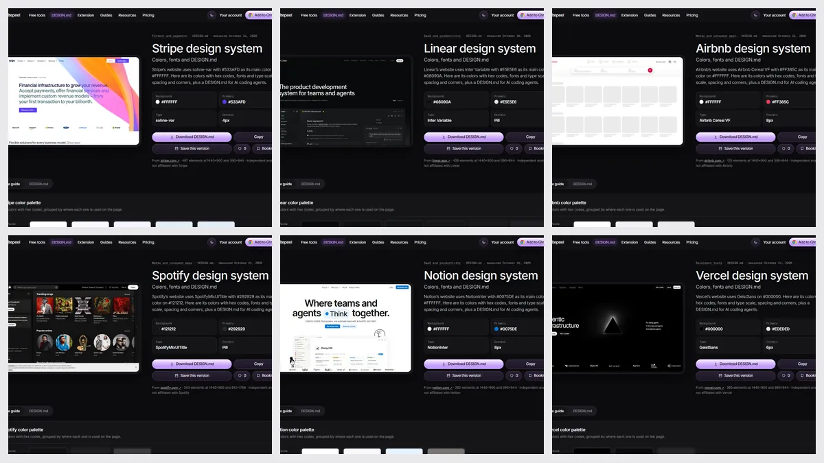
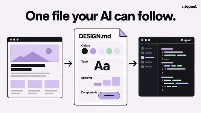
Each brand’s DESIGN.md comes from Sitepeel’s DESIGN.md generator, which opens the live page at 1440px wide (and at 390px for phone sizes) and reads the styles the browser actually rendered. We measured each site once, from October 21 to October 26, 2026.
Main text font: the family that sets the most text styles on the page
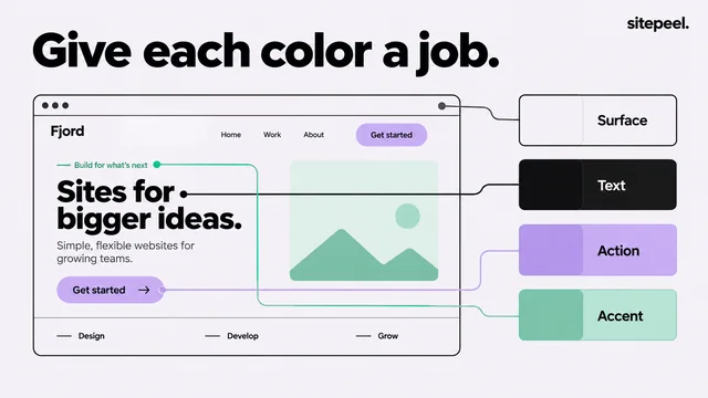
Accent color: the color the page uses for its main buttons, links or logo
Dark mode: the page background is dark when it first opens
Fonts keep the names the sites give them, folded together across weights
One page per brand, usually its home page, as a visitor first sees it
An independent measurement, not any brand’s official design system
Download the data and cite it
The CSV has one row per brand: theme, background, text and accent colors, every font, headline and body sizes, button corners and shadows, plus a link to its full DESIGN.md. Free to use with credit (CC BY 4.0).
citation.mdMarkdown
Sitepeel (2026). The fonts and colors of 168 top websites. Measured October 21 to October 26, 2026. https://sitepeel.dev/reports/top-website-fonts-and-colors/
What is the most popular font on websites in 2026?
Inter. 43 of the 168 top brand sites we measured use it, 30 for their main text. Geist and the device’s own system font come next among the fonts we could name.
What fonts do big brands use?
Mostly their own. 54% of the 168 brands set their main text in a commercial or custom typeface, such as Airbnb Cereal, Uber Move or Söhne. Only 18% use Inter for it.
What is the most common brand color on websites?
Blue: 45 of 168 sites (27%) use it as their main accent. As many use black, white or gray instead of a color.
How many websites use dark mode by default?
44% of the 168 sites open in dark mode. Developer tools lean dark (27 of 37); marketing and analytics tools lean light.
What font size do websites use for body text?
16px is the most common (47% of sites). The median headline is 60px on a laptop and 38px on a phone.
Can I use this data?
Yes. The CSV is free to use with credit (CC BY 4.0). Link to this page as the source.