
 Claude Code
 Cursor
 Codex
 GitHub Copilot
 WiseBrand
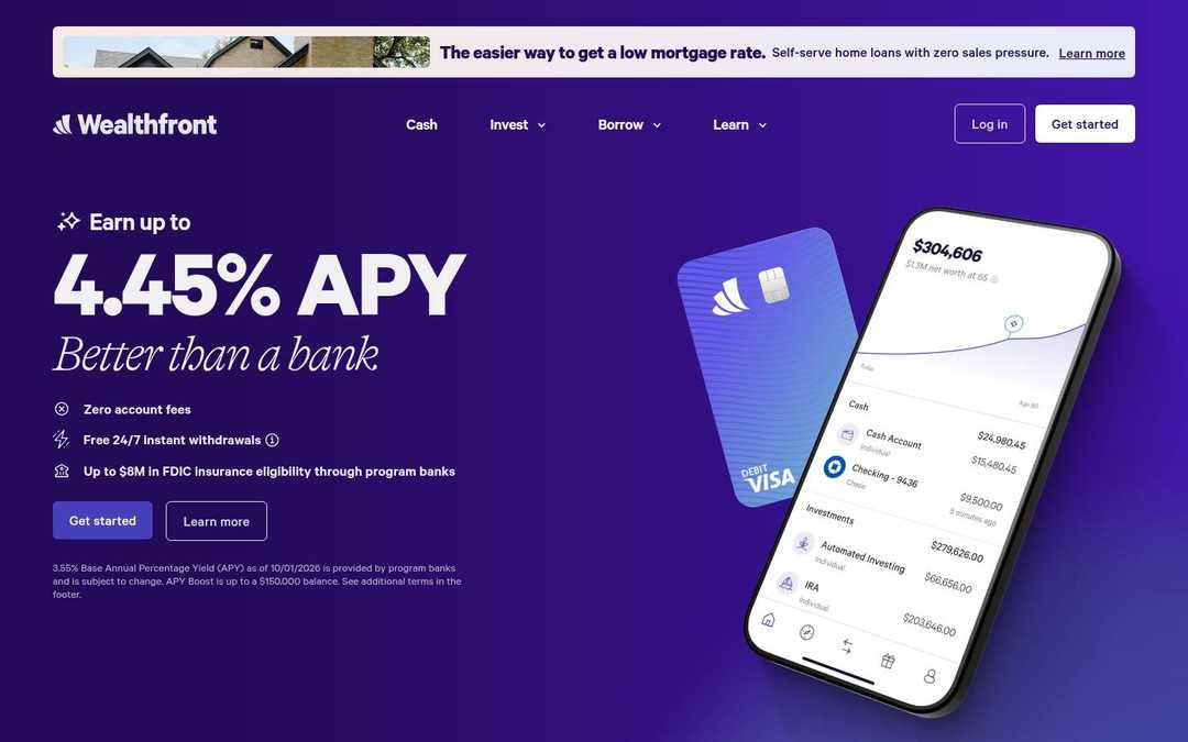
Fintech and payments · DESIGN.md · measured November 4, 2026
Wealthfront design system
Wealthfront’s website (wealthfront.com) uses the Calibre font and #4840BB as its main color on a #F8F7FC background. Measured by Sitepeel on November 4, 2026.
- #F8F7FC
- #F4F3F7
- #18172B
- #4840BB
From wealthfront.com ↗ · 262 elements at 1440×900 and 390×844 Independent analysis, not affiliated with Wealthfront
Wealthfront color palette
11 colors with hex codes, grouped by where each one is used on the page.
Surfaces
Snow
#F8F7FCbackgroundPage background · 3×Snow
#F4F3F7surface-container-lowRaised areas one step from the page · 3×White
#FFFFFFsurface-container · --tw-ring-offset-colorCards and panels · 2×Text
Deep Indigo
#18172Bon-surface · --tk-surface-invertedPrimary text and headings · 11×Dark Indigo
#424158on-surface-variantSecondary text · 3×Cool Silver
#B7B7C0on-surface-mutedMuted text and metadata · 45×White
#FFFFFFon-primaryText and icons on primaryAccents
Indigo
#4840BBprimaryPrimary buttons and calls to action · 30×Deep Violet
#230B59secondaryAccent in logos and imagery · 3×Dark Violet
#2E0E74tertiaryAccent in logos and imageryBorders
Pale Indigo
#DADEF1outlineBorders and dividers · 2×Wealthfront fonts and type scale
One family carries the whole interface.
AaCalibreWeights 400, 500, 600, 700Calibre, ui-sans-serif, system-ui, -apple-system
headline-displayPage title (h1)Wealthfront62px · 700 · 0.9 · -0.03em
mobile 42px
mobile 42px
headline-lgSection headings (h2)The quick brown fox jumps over the lazy dog48px · 700 · 0.9 · -0.03em
headline-mdSub-section headingsThe quick brown fox jumps over the lazy dog32px · 400 · 1.1
headline-smCard and feature titlesThe quick brown fox jumps over the lazy dog24px · 600 · 1 · -0.02em
title-lgSmall titlesThe quick brown fox jumps over the lazy dog22px · 700 · 1.5
body-mdBody textThe quick brown fox jumps over the lazy dog18px · 500 · 1.2
body-lgLead paragraphsThe quick brown fox jumps over the lazy dog20px · 600 · 0.9 · -0.03em
body-smSecondary and small textThe quick brown fox jumps over the lazy dog12px · 400 · 1.33
label-lgLarge buttons and tabsThe quick brown fox jumps over the lazy dog18px · 400 · 1.5
label-mdButtons, navigation and labelsThe quick brown fox jumps over the lazy dog14px · 600 · 0.9
label-smSmall labels and badgesThe quick brown fox jumps over the lazy dog12px · 500 · 1.33
Contrast
Text on #F8F7FC
AaAAA
16.4:1AaAAA
9.2:1AaLarge only
1.8:1Spacing
No strict grid · 78% are multiples of 4px
xs2pxsm8pxmd12pxlg20pxxl64pxgutter32pxBreakpoints: 320px 384px 400px 480px 481px 767px 768px 959px 960px 1139px 1140px 1536px 2024px
Shapes
Corner radii, most used first.
sm6px · 36×
md16px · 28×
full9999px · 12×
Depth
Flat: no shadows measured.
Wealthfront UI components
Rebuilt from the measured CSS.
Get started
Get started
Log in
Inline link
Motion
Interface transitions
0.15s0.2scubic-bezier(0.4, 0, 0.2, 1)cubic-bezier(0, 0, 0.2, 1)
Do’s and don’ts
Rules written from the measurements, so a coding agent stays on style.
- Use #F8F7FC for the page and lift surfaces in small steps: #F4F3F7, #FFFFFF.
- Keep text in 3 levels: #18172B, #424158, #B7B7C0.
- Reserve #4840BB for primary actions and key highlights.
- Set headlines in Calibre with tight tracking (-0.03em).
- Reuse the measured spacing steps (8px, 12px, 20px).
- Use 6px corners on most elements; larger surfaces also use 16px.
- Use #B7B7C0 for body text; it reaches 1.87:1 on #F8F7FC. Keep it for large text or metadata.
- Add drop shadows for depth; use tonal surfaces.
- Introduce new font families beyond Calibre.
- Use #4840BB for large backgrounds or body text.
- Make interface transitions slower than 0.2s.
Wealthfront DESIGN.md217 lines
---
version: alpha
name: Wealthfront
description: "Light interface measured from wealthfront.com: Calibre type, indigo accents, tonal surfaces and 6px corners."
colors:
  background: "#F8F7FC"
  surface: "#F8F7FC"
  on-surface: "#18172B"
  on-background: "#18172B"
  on-surface-variant: "#424158"
  on-surface-muted: "#B7B7C0"
  surface-container-low: "#F4F3F7"
  surface-container: "#FFFFFF"
  outline: "#DADEF1"
  primary: "#4840BB"
  on-primary: "#FFFFFF"
  secondary: "#230B59"
  tertiary: "#2E0E74"
typography:
  headline-display:
    fontFamily: Calibre
    fontSize: 62px
    fontWeight: 700
    lineHeight: 0.9
    letterSpacing: -0.03em
  headline-lg:
    fontFamily: Calibre
    fontSize: 48px
    fontWeight: 700
    lineHeight: 0.9
    letterSpacing: -0.03em
  headline-md:
    fontFamily: Calibre
    fontSize: 32px
    fontWeight: 400
    lineHeight: 1.1
  headline-sm:
    fontFamily: Calibre
    fontSize: 24px
    fontWeight: 600
    lineHeight: 1
    letterSpacing: -0.02em
  title-lg:
    fontFamily: Calibre
    fontSize: 22px
    fontWeight: 700
    lineHeight: 1.5
  body-md:
    fontFamily: Calibre
    fontSize: 18px
    fontWeight: 500
    lineHeight: 1.2
  body-lg:
    fontFamily: Calibre
    fontSize: 20px
    fontWeight: 600
    lineHeight: 0.9
    letterSpacing: -0.03em
  body-sm:
    fontFamily: Calibre
    fontSize: 12px
    fontWeight: 400
    lineHeight: 1.33
  label-lg:
    fontFamily: Calibre
    fontSize: 18px
    fontWeight: 400
    lineHeight: 1.5
  label-md:
    fontFamily: Calibre
    fontSize: 14px
    fontWeight: 600
    lineHeight: 0.9
  label-sm:
    fontFamily: Calibre
    fontSize: 12px
    fontWeight: 500
    lineHeight: 1.33
  headline-display-mobile:
    fontFamily: Calibre
    fontSize: 42px
    fontWeight: 700
    lineHeight: 0.9
    letterSpacing: -0.03em
rounded:
  sm: 6px
  md: 16px
  full: 9999px
spacing:
  xs: 2px
  sm: 8px
  md: 12px
  lg: 20px
  xl: 64px
  gutter: 32px
components:
  button-primary:
    backgroundColor: "{colors.primary}"
    textColor: "{colors.on-primary}"
    typography: "{typography.body-md}"
    rounded: "{rounded.sm}"
    padding: 12px 20px
    height: 46px
  button-outline:
    backgroundColor: "{colors.surface-container}"
    textColor: "{colors.secondary}"
    typography: "{typography.body-md}"
    rounded: "{rounded.sm}"
    padding: 12px 20px
    height: 46px
  button-outline-hover:
    textColor: "{colors.on-primary}"
  button-ghost:
    textColor: "{colors.outline}"
    typography: "{typography.body-md}"
    rounded: "{rounded.sm}"
    padding: 12px 20px
    height: 48px
  link:
    textColor: "{colors.on-surface-muted}"
---

# Wealthfront Design System

## Overview

Wealthfront describes itself as: “Wealthfront makes building wealth easy. Earn 3.55% APY on your uninvested cash and invest in expert-built, automated portfolios of stocks, bonds, and ETFs.” The interface is light, built on **Snow (#F8F7FC)** with **Deep Indigo (#18172B)** text, and **Indigo (#4840BB)** as the main accent.

Type is set in **Calibre**. Headlines run large with tight negative tracking; body text is 18px. The surface language is flat. Corners are mostly 6px.

Measured from [wealthfront.com](https://www.wealthfront.com/) on November 4, 2026 at 1440×900 and 390×844 from 262 rendered elements. Values are computed styles from the live page, not the original source files.

## Colors

The palette has 11 roles.

- **Snow (#F8F7FC):** Page background, seen 3 times. Token `background`.
- **Deep Indigo (#18172B):** Primary text and headings, seen 11 times. Token `on-surface`, CSS `--tk-surface-inverted`.
- **Dark Indigo (#424158):** Secondary text, seen 3 times. Token `on-surface-variant`.
- **Cool Silver (#B7B7C0):** Muted text and metadata, seen 45 times. Token `on-surface-muted`.
- **Snow (#F4F3F7):** Raised areas one step from the page, seen 3 times. Token `surface-container-low`.
- **White (#FFFFFF):** Cards and panels, seen 2 times. Token `surface-container`, CSS `--tw-ring-offset-color`.
- **Pale Indigo (#DADEF1):** Borders and dividers, seen 2 times. Token `outline`.
- **Indigo (#4840BB):** Primary buttons and calls to action, seen 30 times. Token `primary`.
- **White (#FFFFFF):** Text and icons on primary. Token `on-primary`.
- **Deep Violet (#230B59):** Accent in logos and imagery, seen 3 times. Token `secondary`.
- **Dark Violet (#2E0E74):** Accent in logos and imagery. Token `tertiary`.

## Typography

**Calibre** carries the whole interface. Fallback stack: `Calibre, ui-sans-serif, system-ui, -apple-system`. Other loaded fonts: GT Alpina.

- **headline-display:** Calibre 62px at weight 700, line height 0.9, tracking -0.03em (42px on mobile). Page title (h1).
- **headline-lg:** Calibre 48px at weight 700, line height 0.9, tracking -0.03em. Section headings (h2).
- **headline-md:** Calibre 32px at weight 400, line height 1.1. Sub-section headings.
- **headline-sm:** Calibre 24px at weight 600, line height 1, tracking -0.02em. Card and feature titles.
- **title-lg:** Calibre 22px at weight 700, line height 1.5. Small titles.
- **body-md:** Calibre 18px at weight 500, line height 1.2. Body text.
- **body-lg:** Calibre 20px at weight 600, line height 0.9, tracking -0.03em. Lead paragraphs.
- **body-sm:** Calibre 12px at weight 400, line height 1.33. Secondary and small text.
- **label-lg:** Calibre 18px at weight 400, line height 1.5. Large buttons and tabs.
- **label-md:** Calibre 14px at weight 600, line height 0.9. Buttons, navigation and labels.
- **label-sm:** Calibre 12px at weight 500, line height 1.33. Small labels and badges.

## Layout

Spacing is mostly on a 4px grid (78% of measured values), with some off-grid steps. Match the measured scale rather than rounding everything.

- **Scale:** xs 2px, sm 8px, md 12px, lg 20px, xl 64px.
- **Gaps:** 32px is the most common gap in flex and grid layouts.
- **Breakpoints:** 320px, 384px, 400px, 480px, 481px, 767px, 768px, 959px, 960px, 1139px, 1140px, 1536px, 2024px.

## Elevation & Depth

The design is flat: no shadows were measured. Hierarchy comes from tonal surface steps (#F4F3F7 → #FFFFFF) and #DADEF1 borders.

## Shapes

Most elements use 6px corners. Measured radii, most used first:

- **sm (6px):** 36 elements.
- **md (16px):** 28 elements.
- **full (9999px):** 12 elements.

## Components

Measured from the rendered page. Token values reference the tokens above.

- **button-primary (“Get started”):** #4840BB fill, #FFFFFF text, 18px/500, 6px radius, padding 12px 20px.
- **button-outline (“Get started”):** #FFFFFF fill, #230B59 text, 18px/500, 6px radius, padding 12px 20px.
- **button-outline-hover:** background #FFFFFF, text #FFFFFF on hover.
- **button-ghost (“Log in”):** transparent fill, #DADEF1 text, 18px/500, 6px radius, padding 12px 20px, border 1px solid #DADEF1.
- **link:** transparent fill, #B7B7C0 text, padding 0px.

## Do's and Don'ts

- Do use #F8F7FC for the page and lift surfaces in small steps: #F4F3F7, #FFFFFF.
- Do keep text in 3 levels: #18172B, #424158, #B7B7C0.
- Do reserve #4840BB for primary actions and key highlights.
- Do set headlines in Calibre with tight tracking (-0.03em).
- Do reuse the measured spacing steps (8px, 12px, 20px).
- Do use 6px corners on most elements; larger surfaces also use 16px.
- Don't use #B7B7C0 for body text; it reaches 1.87:1 on #F8F7FC. Keep it for large text or metadata.
- Don't add drop shadows for depth; use tonal surfaces.
- Don't introduce new font families beyond Calibre.
- Don't use #4840BB for large backgrounds or body text.
- Don't make interface transitions slower than 0.2s.

## Motion

Interface transitions are quick: 0.15s, 0.2s.

- **Easing:** `cubic-bezier(0.4, 0, 0.2, 1)`, `cubic-bezier(0, 0, 0.2, 1)`.
- **Reduced motion:** the page responds to `prefers-reduced-motion`.

Generated by [Sitepeel](https://sitepeel.dev/design-md/wealthfront.com/), the free DESIGN.md generator (engine 2026.10.29+b828a475ee10).
Fonts
What font does Wealthfront use?
Wealthfront uses Calibre (weights 400, 500, 600 and 700) on wealthfront.com. Page titles are 62px at weight 700 (42px on phones) and body text is 18px. Measured on November 4, 2026.
- AaCalibre · 400, 500, 600, 700
Colors
Wealthfront colors: palette and hex codes
Wealthfront’s main colors are #F8F7FC (snow) for the background, #18172B (deep indigo) for text and #4840BB (indigo) as the main accent, with #230B59 (deep violet) and #2E0E74 (dark violet) as other accents. Measured on November 4, 2026.
- #F8F7FC · snow
- #18172B · deep indigo
- #424158 · dark indigo
- #B7B7C0 · cool silver
- #F4F3F7 · snow
- #FFFFFF · white
- #DADEF1 · pale indigo
- #4840BB · indigo
Tech stack
What is Wealthfront built with?
Wealthfront’s website (wealthfront.com) is built with Next.js, React, Radix UI, Tailwind CSS and Amazon S3. Measured on November 4, 2026.
- JavaScript framework
- Next.js 15.5.28, React 18.2.0
- Analytics
- RudderStack, Sentry 8.48.0, Meta Pixel, Microsoft Advertising
- Hosting & CDN
- Amazon S3, Fastly
- UI & CSS
- Radix UI, Tailwind CSS 3.x
- Animation & 3D
- Motion
What you can build with it
Landing pages, pricing tables, dashboards: your AI coding agent builds them in this style, with these colors, fonts, spacing and buttons instead of its defaults.
Download DESIGN.md, put it in your project’s root folder, then ask your agent for a page.
Build a landing page for my product. Follow for every color, font, spacing value, corner and button.
Need a page behind a login?
The DESIGN.md generator Chrome extension makes one from any page you have open, including dashboards and pages behind a login.
More in Fintech and payments
All DESIGN.md examples →


Not in the library? Make a DESIGN.md from any site.
FAQ
Wealthfront design system questions
What font does Wealthfront use?
Wealthfront’s website uses Calibre (weights 400, 500, 600 and 700). Page titles are 62px at weight 700 (42px on phones) and body text is 18px. Measured on November 4, 2026.
What are the Wealthfront colors and hex codes?
On wealthfront.com: #F8F7FC (snow) for the background, #18172B (deep indigo) for text and #4840BB (indigo) as the main accent, with #230B59 (deep violet) and #2E0E74 (dark violet) as other accents. The color palette above lists all 11 colors with their hex codes and where each one is used.
What is the Wealthfront design system?
The design system on this page is wealthfront.com’s, as measured on November 4, 2026: Calibre type, #4840BB as the main color and 6px corners, written down as a DESIGN.md. It is not Wealthfront’s own documentation.
What is Wealthfront built with?
Wealthfront’s website (wealthfront.com) is built with Next.js, React, Radix UI, Tailwind CSS and Amazon S3. The full tech stack Sitepeel found: Next.js, React, RudderStack, Sentry, Amazon S3, Meta Pixel, Microsoft Advertising, Radix UI, Tailwind CSS and Motion. Measured on November 4, 2026.
What is the Wealthfront DESIGN.md?
A plain-text file with Wealthfront’s measured colors, type, spacing, corners and components as tokens, plus short rules, in the DESIGN.md format Google published with Stitch. Your AI coding agent reads it and builds in this style. More about DESIGN.md.
How do I use it with Claude Code or Cursor?
Download the file and put it in your project’s root folder, then ask your agent to follow DESIGN.md. Step-by-step guides: Claude Code, Cursor, Codex, GitHub Copilot.
Is this Wealthfront’s official design system?
No. Sitepeel measured it from wealthfront.com’s public page on November 4, 2026. It is an independent analysis, not made or approved by Wealthfront.
Can I use Wealthfront’s style in my own product?
Use it to learn, prototype and compare. For a real product, make the style your own, and never copy Wealthfront’s logo, name, pictures or text.
How accurate are the values?
Each value was measured on the rendered page after it fully loaded, on desktop and mobile: colors where they appear, type with tracking, spacing, corners, shadows and hover states. Sites change, so check the date at the top.